Version 9.3.0
Release date: April 15, 2024
New features
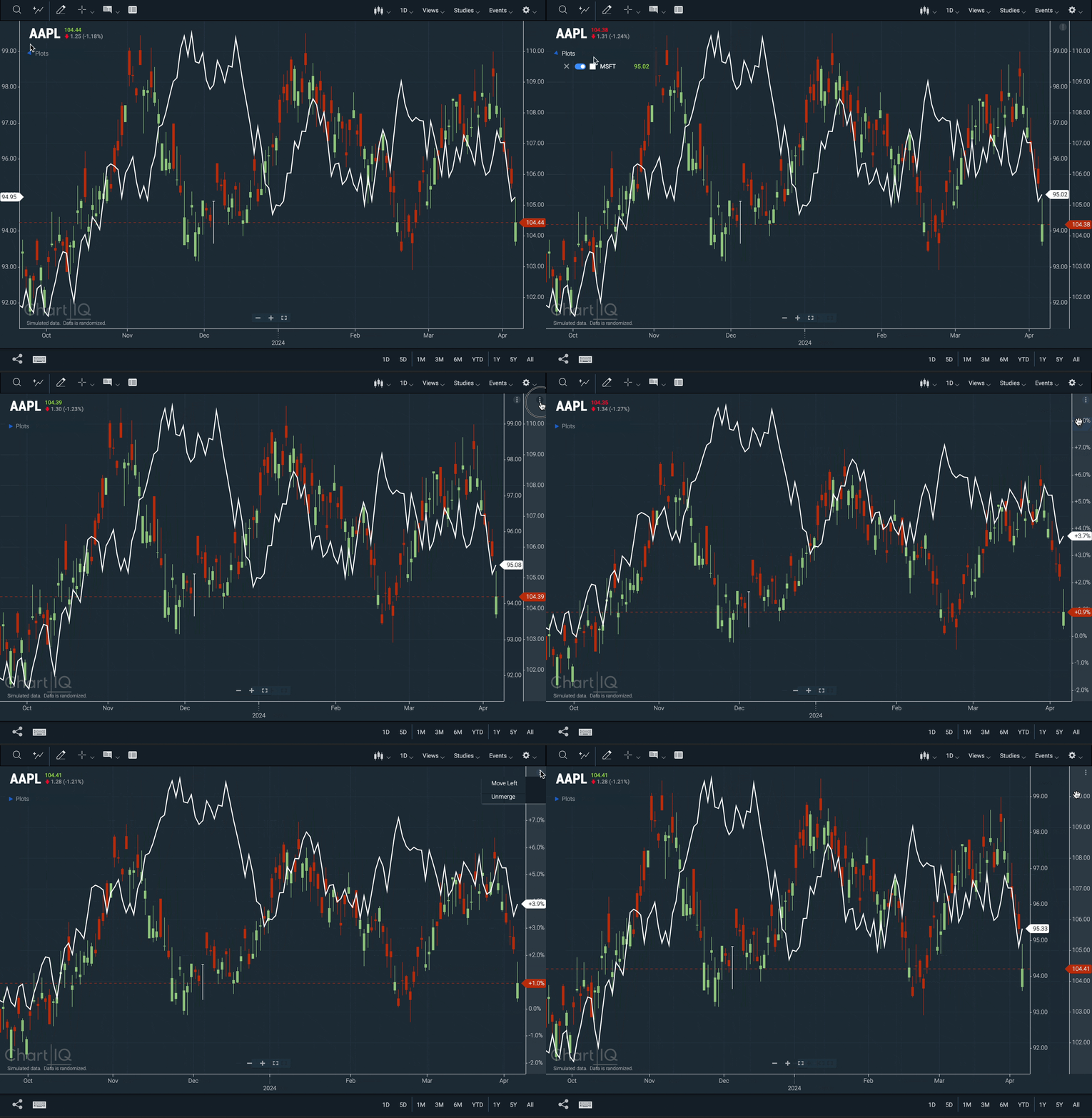
Y-Axis Menu
Users can now customize the layout of the chart using menus located on the Y-axes.

- Position the y-axis on the left or right side of the chart by accessing the menu at the top right of the y-axis or by right-clicking anywhere on the axis.
- Multiple axes can be merged and unmerged if they exist on the same side of the chart.
- Menus are tab navigable.
Enhancements
Swimlane Marker Consolidation
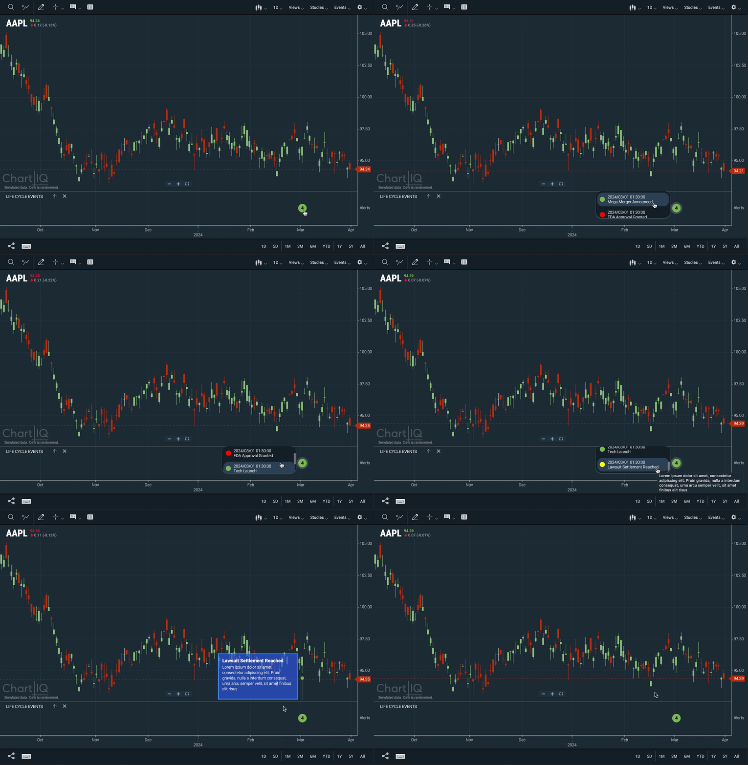
Swimlane events on the same bar are now displayed as consolidated markers, indicating the number of events contained within.

- Data points containing multiple events are represented by a colored circle with a number inside it.
- The number corresponds to the count of events contained in that marker.
- The circle's color is determined by the most frequently occurring color.
- Clicking on the circle will open a menu that displays all events for that data point. From there, clicking on any of the events will open the tooltip associated with that event.
- Update to the CIQ.Marker.Group function adds the
noInteractionparameter. Set totrueto disable the marker's default click handler. - New CIQ.Marker.Group#remove function removes the group marker from the chart object and resets the active state of all markers in group.
- New CIQ.Marker.GroupNode#getGroupMarkerBackgroundColor function returns background color choice for the group marker.
- New CIQ.Marker.GroupNode#markerSortFunction function, which is used when sorting the grouped markers array. Defaults to sorting chronologically from newest to oldest.
- New CIQ.Marker.GroupNode#getDateLabel function returns the display label for a grouped marker x position.
- New CIQ.Marker.GroupNode#handleMenuClick function displays a marker expansion for the group marker. If the expansion is already displayed, it is removed.
- New CIQ.Marker.TimeSpanEvent.Group function creates a marker group for Life Cycle Events.
- New CIQ.Marker.TimeSpanEvent.Group#createNode function creates a CIQ.Marker.TimeSpanEvent.GroupNode object for use as the node of a group marker.
- New CIQ.Marker.TimeSpanEvent.Group.placementFunction function determines the placement of time span event group markers.
- New CIQ.Marker.TimeSpanEvent.GroupNode function creates an HTML marker node used by CIQ.Marker.TimeSpanEvent.Group.
- New CIQ.Marker.TimeSpanEvent.GroupNode#handleMenuClick function displays a marker expansion for the group marker.
sample-template-multichart.html
The multichart sample template has been updated to use our recently re-architected web components.
This update brings sample-template-multichart.html in line with our other sample templates, such as Advanced, Basic, Institutional, and Options. These templates are located in the chartiq/examples/templates directory.
Additional improvements include:
- Improved accessibility with voiceover and tab navigation support.
- New and updated emitters and attributes to better customize and interact with the chart.
Important: Please be aware that the refactoring of this template to utilize the re-architected web components has resulted in the legacy web components being incompatible with the templates mentioned above in version 9.3.0. For instructions on how to continue using legacy web components, refer to the upgrade instructions from our 9.1.2 release.
UI Enhancements
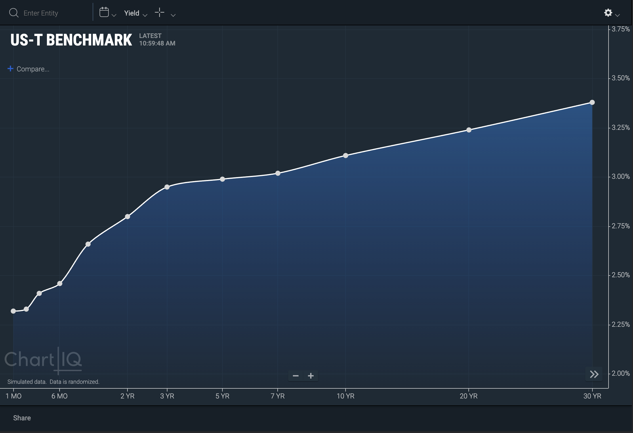
Mountain-style shading and Histogram Rendering for Crossplot charts
Developers can now enable mountain chart style shading as well as histograms on crossplot charts.
Mountain-style shading

Example:
// enable mountain-style shading
stxx.setChartType('crosssection_mountain');
// remove the shading
stxx.setChartType('crosssection');
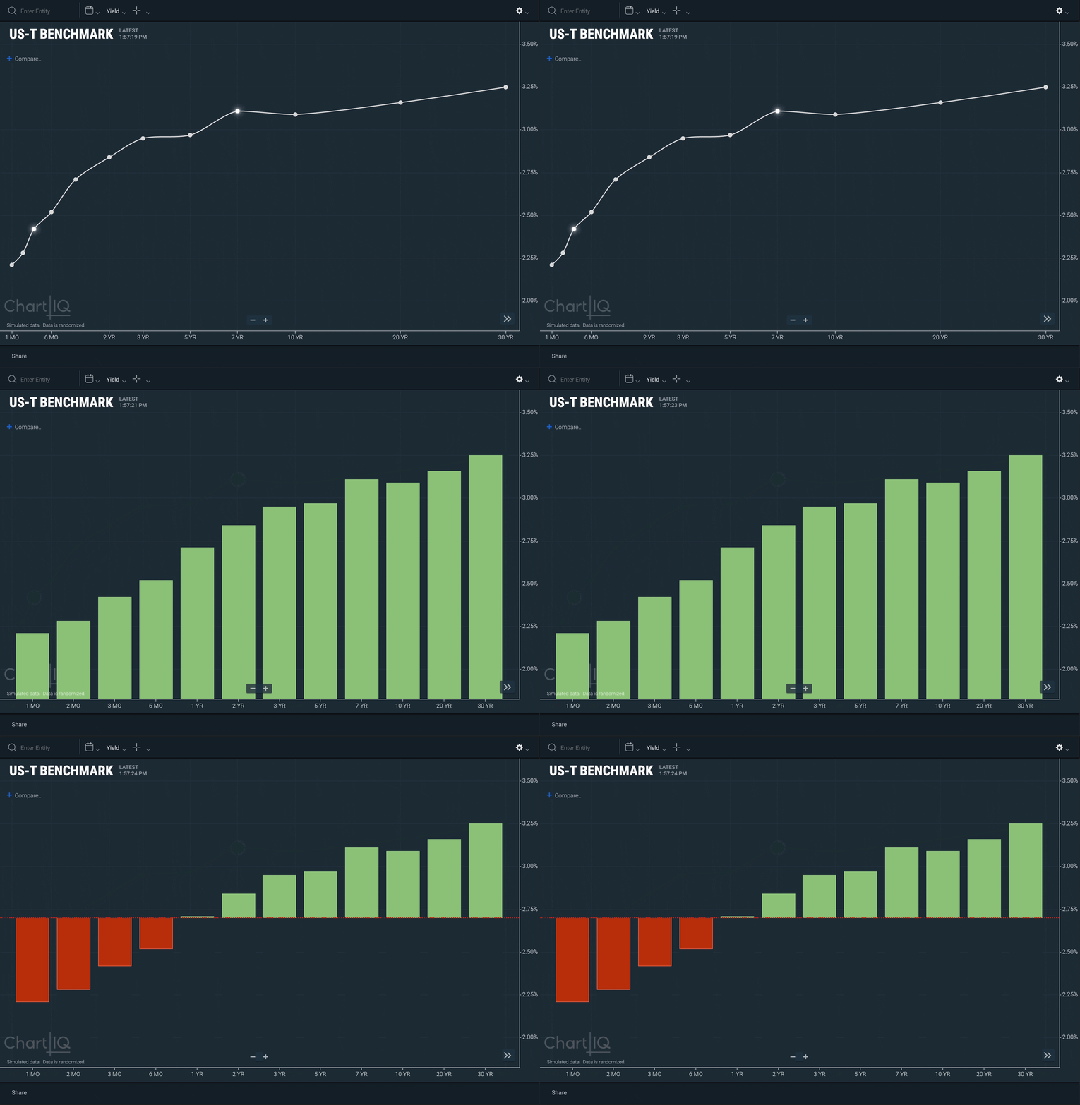
Histograms on crossplot charts
When using a histogram, you can define and customize the baseline value. See below for an example.

- New CIQ.CrossSection#setChartType function sets crosssection render type.
Example:
// Histogram
stxx.crossSection.setChartType("histogram");
// The baseline value for the vertical columns can be defined in the baseline parameter:
stxx.crossSection.setChartType("histogram", { baseline: { value: 2.7 } });
// The baseline can be visually rendered using color, pattern, and lineWidth parameters:
stxx.crossSection.setChartType("histogram", { baseline: { value: 2.7, color: "red", pattern: "dotted", lineWidth: 2 } });
