
Navigating the Chart Interface
The ChartIQ chart user interface has been carefully designed by our user experience (UX) team to be intuitive and versatile. Performance, accuracy, and responsiveness combine to make using our charts almost a tactile experience.
This tutorial takes you on a tour of the chart UI and reveals some of the nuances and considerations that went into the interface design.
Symbol input
The syntax for instrument symbols depends on your data feed. The chart allows both a single symbol or an equation composed of multiple symbols. Symbology rules for determining the type of symbol (stocks, forex, indices, funds, futures, etc.) must be set to enable proper functionality. To enable equations to be used on a chart, the CIQ.ChartEngine#allowEquations parameter must be set to true, and the equation needs to be preceded by an equals sign (=) for it to be parsed as an equation, for example:
stxx.loadChart("=2*IBM-GM");
See the equations tutorial for more details on API calls supporting equations.
Panning
In general, navigation of the chart is similar to using standard online map apps. A chart is panned (scrolled) by dragging the chart. On desktop devices, a user grabs the chart with the mouse and can drag it left, right, up, or down. On touch devices, a single finger touch moves the chart from side to side or up and down.
On laptop touchpads, a two-finger horizontal stroke pans the chart left or right. On all devices, a swipe action rapidly scrolls the chart in the swipe direction, slowing with an easing animation.
The up, down, left, and right arrow keys, along with the Home and End keys, pan the chart. See the Accessibility section.
When a chart is panned so that the most recent bar is hidden, a "home" icon appears on the lower right corner of the screen. Pressing this icon animates the chart back to the home position. This can also be accomplished programmatically by calling stxx.home().
It is possible to programmatically move the chart left or right and to animate to specific locations with the CIQ.ChartEngine#scrollTo method. Using this technique, it is relatively easy to set up keyboard shortcuts for panning. The provided sample templates include support for panning left and right using the arrow keys.
Note: On touch devices, when the crosshairs are enabled, two fingers can be used to pan the chart.
Panning defaults
See CIQ.ChartEngine.Chart#allowScrollPast and CIQ.ChartEngine.Chart#allowScrollFuture to override the horizontal panning defaults.
By default, vertical panning stops when 1/5 of the chart is visible, preventing it from completely scrolling off-screen unless you zoom the y-axis down. Once the zoom level is negative (indicating vertical shrink), this limitation is removed. You can set the y-axis zoom to a small negative value in your loadChart callback to force this.
Example:
stxx.loadChart(
	"SPY",
	{
		masterData: sample5min,
		periodicity: {
			period: 1,
			interval: 5,
			timeUnit: "minute"
		}
	},
	function() {
		stxx.chart.yAxis.zoom = -0.0000001;
	}
);
Zooming
The mouse wheel or touchpad is the primary interface for zooming a chart. A two-finger up/down stroke on a laptop touchpad zooms the chart. Likewise, mouse wheel movement allows rapid zooming. On touch devices, zooming is done by pinching the screen.
You can adjust the data range of the x-axis or y-axis by clicking and dragging the respective axis. This will increase or decrease the range of data displayed, and the chart will update accordingly.
(+) and (-) zoom buttons are placed on the screen as a convenience for users as well.
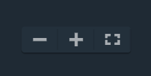
Figure. Zoom out, zoom in, and Full Screen buttons.
The methods CIQ.ChartEngine#zoomIn and CIQ.ChartEngine#zoomOut enable developers to programmatically zoom the chart in or out. Each call zooms the chart by approximately 10% (the same as clicking on the +/- buttons). Precise zooming can be accomplished programmatically through manipulation of candle width by calling CIQ.ChartEngine#zoomSet.
Note: By default, scrolling up on the chart using the mouse wheel or trackpad zooms the chart in. You can reverse this behavior by setting stxx.reverseMouseWheel=true.
Drawing
Drawing is a modal activity. Drawing mode is activated by selecting a tool from the drawing toolbar (programmatically stxx.changeVectorType(tool)).
By default, drawing mode remains in effect until a user "unselects" drawing mode (by choosing "none" tool or by closing the drawing toolbar). Some product designers prefer a "one and done" interface where drawing mode is automatically deactivated after a drawing is completed. The following code will set the chart to "one and done" mode:
stxx.addEventListener("drawing", function() {
	this.changeVectorType(null);
});
Developers can enable two possible modes for making drawings:
-
Default mode — The default method is a multi-click process. After a tool is selected, the user clicks once to begin drawing (if crosshairs are enabled, they will change color). The user then drags the mouse to the drawing endpoint and clicks again to finish the drawing. On touch devices, the user first positions the crosshair with their finger and then "taps" the screen to start the drawing and then, after dragging to the right position and size, taps again to complete it. This default mode is advantageous for two reasons. First, it gives the user more control, allowing them to carefully place their crosshairs and create accurate drawings. The second advantage is that this mode supports complex drawings that require more than two clicks (e.g., channels).
-
Drag to draw — The second method allows users to drag out drawings in a familiar way. Once a user selects a tool, they place their mouse or finger and create a drawing in a single stroke much as they would in a Paint program. This is often considered a more intuitive drawing method but lacks the accuracy and support for multi-point drawings. See CIQ.Drawing#dragToDraw for more details.
Drawings retain their shape and scale across different periodicities. Clicking and dragging the body of a drawing will move it to another location. Hovering over a drawing, or tapping a drawing, will reveal its endpoints. The endpoints can be dragged to change the drawing's shape. To delete a drawing, hover over it to highlight, then right-click. On touch devices, tap the drawing to highlight and then tap "the trash" can icon. (In the provided sample templates, hitting the "delete" or "backspace" key will also delete a highlighted drawing).
All drawings can be removed programmatically by calling CIQ.ChartEngine#clearDrawings. The drawing toolbar in the provided sample templates include a menu item to clear drawings.
Note: On touch devices, a user's crosshair will be positioned slightly up and to the left of the finger. This is important because it allows the user to see what they are highlighting.
Drawing palette
The drawing palette contains a large assortment of drawing tools along with a variety of controls used to configure the palette and manage drawings.

| Control | Description |
|---|---|
 |
Displays the drawing tools in a list view. |
 |
Displays the drawing tools in a grid view (as shown). |
 |
Detaches the palette from the side of the screen, making the palette draggable anywhere onscreen. Drag the detached palette using the drag strip  at the top of the palette. Dock the palette by selecting the Attach control. at the top of the palette. Dock the palette by selecting the Attach control.  |
 |
Deselects the current drawing tool; that is, sets the palette so that no drawing tool is in use. |
 |
Enables measurements of the chart area. Select the measure tool, then draw a line on the chart to measure an area. |
 |
Undoes drawing actions. |
 |
Restores drawing actions removed by Undo. |
 |
Enables selection of subsets of the drawing tools, such as text tools, statistics-related tools, and favorites. |
 |
Causes a drawing tool to be attracted to a data series, such as the main chart series, a comparison series, or a study. Magnetizing a tool to a series provides precise placement of the drawing on the data series line. When the magnet is active, a blue bullet follows the data series to show the value currently selected. The drawing tools are magnetized to the series to which the mouse is closest. As you move the mouse close to another series, the drawing tools magnetize to that series. If a drawing is started on a series, the drawing tool is magnetized to the same series to finish the drawing. |
 |
Removes all drawings from the chart area. |
 |
Restores all drawing settings to their default values. Tool settings can be changed using the style palette. |
 |
Hides all drawings on the chart. Tool settings can be changed using the style palette. |
Favorites
The number of tools displayed on the drawing palette can be reduced by creating a set of favorites.
When the list view of the palette is active (see Drawing palette), a star appears next to each of the drawing tools.

Select the star to mark the tool as one of your favorites.
In grid view on desktop browsers, right click a tool to open a pop-up window, then click the pop-up to add or remove the tool as a favorite.
Favorites are indicated by a star ornament in grid view. 
To see just your favorites, select Favorites from the drawing palette drop-down menu.
Keyboard shortcuts
Drawing tools can be activated by keyboard shortcuts. Shortcuts are activated by pressing the Alt key on Windows or the Option key on Mac with an assigned letter. For example, Alt+L (Windows) or Option+L (Mac) activates the Line tool.
Shortcuts are defined by adding an optional cq-tool-shortcut attribute to the tool button HTML element.
<cq-item class="ciq-tool" cq-tool="line" cq-tool-shortcut="l" cq-tool-group="line" stxtap="tool()">
    <span class="icon line"></span>
    <label>Line</label>
</cq-item>
The letter in the cq-tool-shortcut attribute is case insensitive. Users can press Alt+a or Alt+A (with Shift or Caps Lock) for cq-tool-shortcut="a" or cq-tool-shortcut="A".
The modifier Ctrl can also be part of the shortcut. For example, both Alt+R and Ctrl+Alt+R activate the Rectangle tool. Ctrl can be included when the Alt+key combination is already assigned to a web browser feature or an application on the user’s device.
See the Accessibility section for the keyboard shortcuts supported by the technical-analysis-chart.html and basic-chart.html templates.
Style palette
The style palette appears when a drawing tool is selected. The palette contains controls that enable you to set properties of the drawing tool, such as line width, font, and background color.
Properties vary among tools. For example, the annotation tool has font properties, but does not have a background color or line width; the ellipse tool has background color and line width, but not font properties.

Figure. Style Palette.
| Control | Description |
|---|---|
 |
Detaches the palette from the top of the screen, making the palette draggable anywhere onscreen. Drag the detached palette using the drag strip  on the left side of the palette. Dock the palette by selecting the Attach control. on the left side of the palette. Dock the palette by selecting the Attach control.  |
 |
Identifies the currently selected tool (to which the styles apply). |
 |
Sets the background color of the drawing. |
 |
Sets the foreground or text color of the drawing. |
 |
Sets the line width of the drawing. |
 |
Sets the font in italics. |
 |
Sets the font in boldface. |
 |
Sets the size of the font. |
 |
Sets the font family. |
 |
Saves the style palette settings (the configuration) for the selected tool. The tool retains the configuration even after the chart is closed. To restore the default configuration, select the X next to the Save Config control  or select the Restore Default Parameters control (see Drawing palette above). or select the Restore Default Parameters control (see Drawing palette above). |
Studies
Studies (also known as technical indicators) are added to charts interactively by means of user interface controls such as drop-down menus (see the Studies menu in technical-analysis-chart.html). Studies are added to charts programmatically by calling CIQ.Studies.addStudy.
Studies can be rendered in the main chart panel as overlays to the primary instrument, or they can appear in secondary panels (windows) above or below the chart panel. By default, some studies appear as overlays; some, in secondary panels. The main chart panel cannot be moved or removed, and the primary series cannot be placed in a secondary panel.
 Figure. Alligator study overlaid on chart.
Overlay studies include a context menu that can be used to modify the study or remove it from the chart. To access the context menu:
-
On desktop browsers — Highlight the study by hovering your mouse over the lines or shapes that make up the study. Right click to open the context menu. Select an item from the menu.
-
On touch devices — Tap the study to open the context menu. Tap the gear icon to edit study properties. Tap the x icon to delete the study.

Studies can appear in secondary panels to separate the displays of multiple series.
 Figure. Alligator, Aroon, and MACD studies in secondary panels.
The vertical size of secondary panels can be changed by dragging the panel top and bottom borders.
Secondary panels include a toolbar that can be used to reposition or delete the panel. On desktop browsers, hover your mouse over a study to reveal the toolbar.
| Secondary panel toolbar controls | |
|---|---|
 |
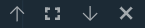
Moves the panel upward in a stack of panels. If the panel is at the top of the stack, positions the panel above the chart. |
 |
Expands the panel and hides any other panels. If the panel has been expanded, returns it to its former size and reveals all hidden panels. |
 |
Moves the panel downward in a stack of panels. If the panel is at the bottom of the stack, positions the panel below the chart. |
 |
Closes the panel and destroys the study. |
Drawings and annotations can be applied to overlay studies and studies in secondary panels using the Drawing palette and Style palette tools.

Figure. Dashed line and annotation on MACD study in secondary panel.
Study legend
A list of the studies applied to a chart can be included in a menu or overlaid on the chart as a legend. In the sample templates, the list of active studies is contained in the Active Studies section of the Studies menu,

Figure. Active studies in the Studies menu.
and in the Plots control, which appears on study panels or on charts when one or more studies overlays the chart.

Figure. Active studies and comparisons in the Plots Legend.
Active Studies and Plots both allow you to edit and delete studies. In either section, you can edit a study by selecting it from the list. To delete a study, click the X icon next to the study name. In Active Studies, you can delete all studies by selecting CLEAR ALL. Additionally, you can hide or show plots using the slider switches.
See the cq-study-legend web component for the details of implementing user interface controls like Active Studies and Plots. See technical-analysis-chart.htmlin the examples/templates folder for a working example.
Drag and drop - Studies
Studies can be positioned and managed through drag-and-drop interactions. Overlay studies can be moved into secondary panels, and those in secondary panels can be dragged onto charts as overlays. You can also combine studies in secondary panels or directly on charts. For more information, see the main Drag and Drop section.
Periodicity and range
It is very important to understand the difference between "periodicity" and "range". While periodicity is the period of time contained within each bar, the range is the total amount of time that is displayed on the chart canvas. Both range and periodicity are measured in units of time. Different combinations of periodicity and range allow the user to view the chart data in many different ways.
Periodicity
The chart natively supports minute, daily, weekly and monthly periods. It also supports any multiple or compound of each, such as 7-minute, 3-day or 2-week periods. This allows firms to support many more periodicities than might be available from their market data feed. For example, a 15-minute period can be made available by specifying 3 x 5 minute intervals. This specification can be done programmatically (CIQ.ChartEngine#setPeriodicity) or through a menu.
It is important to consider the data intervals that are available from your market data feed and to select periodicity settings that meet your users' requirements. It is also crucial that periodicity settings are not selected that would negatively impact performance. For instance, we do not recommend compounding by more than a factor of 10 because it will create very large network requests.
This "period" is too large. Performance will be slow due to large network requests.
stxx.setPeriodicity({ period: 30, timeUnit: "minute" }); // don't do this!
It is important to remember that the time associated with a bar reflects the beginning of the interval. For example, a 1-minute bar starting at 09:30:00.00 covers all data up to 09:30:59.999.
For securities that trade during extended hours sessions (pre and post market), it is possible to enable an extended hour display with the CIQ.ExtendedHours add on. Extended hours display only affects intraday charts (bars in minutes). To support flipping back and forth between display of extended hours, your quote server should accept a flag that will filter out the extra sessions.

Figure. Periodicity Menu.
Range
Range refers to the total span of time that is displayed on the chart. For example, if you have 60 one-minute bars visible in your chart window, you are viewing a range of one hour (1H).
Users can easily adjust the chart to a desired range using the range selector found in the footer of the sample templates. It is important to note that range selectors often manipulate the period in order to neatly fit the bars in the chart window. The period adjustment will vary depending on how much chart canvas is available (i.e., the size of your browser window). For example, selecting a 5D range may adjust the period to 1H at one window size, but the same 5D range may adjust the period to 1.5H at a smaller window size to accommodate the bars.
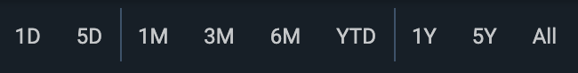
Figure. Range Selector.
Chart styles and types
A variety of chart types (candle, bar, line, etc.) and aggregation types (Heikin-Ashi, Kagi, Point & Figure, etc.) can be set programmatically (CIQ.ChartEngine#setChartType) or through a menu system. The sample files demonstrate how to incorporate the different types in your menus. These chart styles and types are covered more in-depth in the Chart Styles and Types tutorial.
A variety of different y-axis scales, including 'Log Scale', can be set programmatically by calling CIQ.ChartEngine#setChartScale.
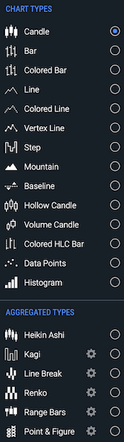
Figure. Chart Types as shown in technical-analysis-chart.html.
Heads-up display (HUD)
A heads-up display (HUD) shows detailed information for series data points as the user mouses over the chart. The template file technical-analysis-chart.html provides three types of HUDs:
- Dynamic callout
- Floating tooltip
- Heads-up Display
Developers can also create custom HUDs.
Dynamic callout
The dynamic callout is enabled from the drop-down menu of the Info control.
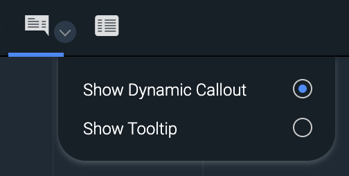
Figure. Info drop-down menu with Show Dynamic Callout selected.
The callout resembles a speech bubble that follows the mouse and points to the bar (data point) over which the mouse is hovering. The callout displays the selected bar's date/time, last price, estimated volume, and open, close, high, and low prices.

Figure. Chart with dynamic callout.
Floating tooltip
The floating tooltip is enabled from the Info control's drop-down menu.
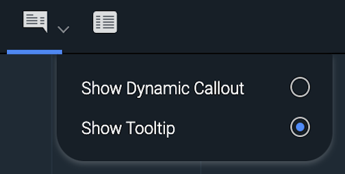
Figure. Info drop-down menu with Show Tooltip selected.
The floating tooltip is a semitransparent display that follows the mouse across the chart, showing the date/time, open, close, high, low prices, and volume of the bar under the pointer. A vertical highlight (or crosshairs, if active) indicates the selected bar. If a study is enabled, relevant study information is also included in the tooltip.
The floating tooltip is provided as an add-on that must be enabled. See the enabledAddOns documentation in the Chart Configuration tutorial for more information.
See CIQ.Tooltip for implementation and customization details.
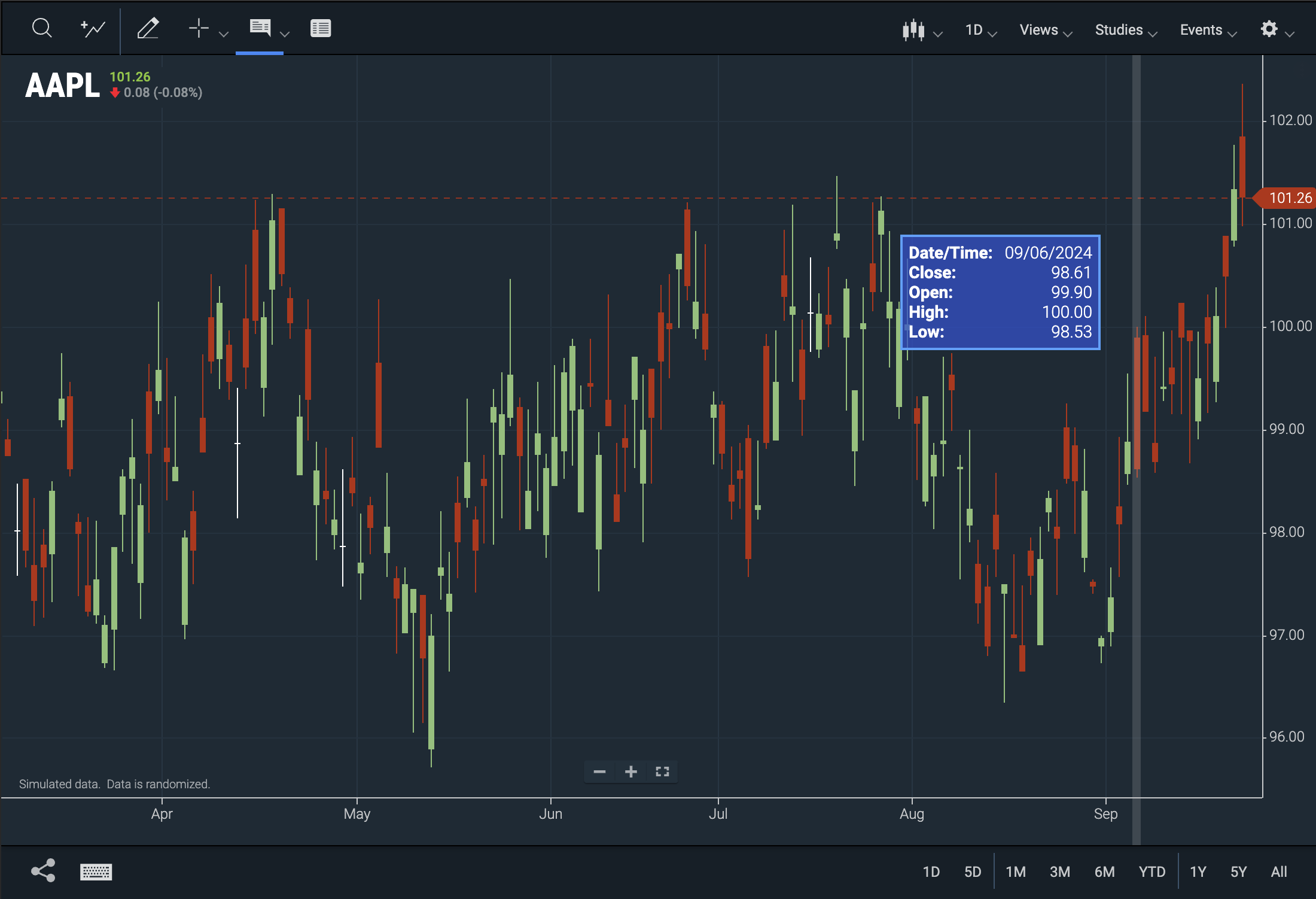
Figure. Chart with floating tooltip and bar highlighting.
Heads-Up Display
The heads-up display is enabled and disabled from the drop-down menu of the crosshairs control.
Note: As of version 9.1.2, this heads-up display can be repositioned using drag-and-drop user interactions.
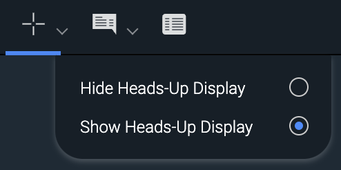
Figure. Crosshairs drop-down menu with Show Heads-Up Display selected.
The static HUD displays data for the bar targeted by the crosshairs. The data includes the bar's last price, open, close, high, low, and estimated volume.
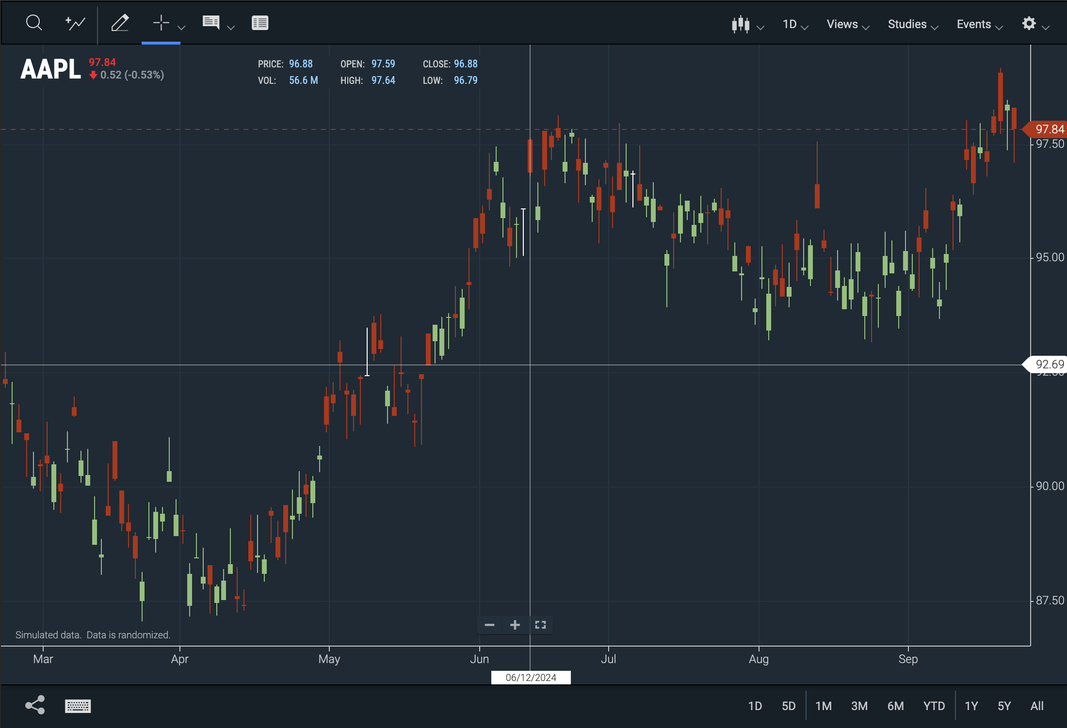
Figure. Chart with crosshairs and static HUD.
Custom HUDs
Developers can create and implement their own heads-up displays using the ChartIQ injection API. See the Using API Injections tutorial.
The code below modifies the DOM with the high price for the bar that is in the chart crosshairs.
// Example assumes a global stxx reference to the chart engine.
// Crosshairs static HUD must be on screen.

let priorBar = null; // Used to prevent running the expensive DOM manipulations unecessarily.

function fillInHUD() {
	// stxx.cx is the crosshairs x-axis position.
	const bar = stxx.barFromPixel(stxx.cx);
	if (bar == priorBar) return;
	priorBar = bar;
	const barData = stxx.chart.xaxis[bar];
	if (barData == null) {
		priorBar = -1;
	} else {
		const barHigh = barData.data.High;
		// Assumes High is returned from your quote feed.
		if (barHigh) {
			// Replace DOM text with updated high.
			document.querySelector("cq-hu-high").innerText = barHigh;
		} else {
			document.querySelector("cq-hu-high").innerText = "";
		}
	}
}

stxx.remove("headsUpHR"); // Remove instance injections.
CIQ.ChartEngine.prototype.remove("headsUpHR"); // Remove prototype injections.
CIQ.ChartEngine.prototype.prepend("headsUpHR", fillInHUD); // Add the new injection.
Drag and drop
Charting elements such as y-axes and series (studies and comparisons) can be positioned and manipulated using drag-and-drop user interactions.
To drag and drop a charting element, do the following:
-
Click and hold the element until one of the drag-and-drop icons appears. The icon indicates the direction in which the element can be dragged:
 — Horizontally
 — Vertically
 — All directions
Note: On mobile devices, press the element until an icon that indicates the drag-and-drop target appears.
-
Drag the element to a container or boundary.
-
Charts, panels, and axes are containers. The edges of charts, panels, and axes are boundaries.
-
A blue rectangle appears when you drag to a container. A blue line appears when you drag to a boundary. The rectangle or line indicates the drop location.
Note: A blue rectangle or line must appear before you can drop an element. At the screen edges, be careful to drag and drop within the charting area. The drag-and-drop icon turns to the default pointer or disappears when you drag an element out of the charting area. If you drop an element outside the charting area, the drag-and-drop action does not take effect.
-
-
Drop the element by releasing the mouse button or lifting your finger or stylus from the screen.
Series
Study and comparison series overlay charts or appear in panels above or below charts.
Series can be managed using drag-and-drop functionality. Chart overlays can be dragged into panels, while series within panels can be dragged onto charts as overlays. Additionally, series can be combined, and the y-axis of a series can be positioned on either the left or right side.
Procedures - Series
- Convert overlay series to panel series — Drag and drop an overlay series onto a top or bottom chart boundary or panel boundary.
- Convert panel series to overlay series — Drag and drop a panel series onto a chart.
- Combine series — Drag and drop multiple overlay series or panel series into a single panel. Or, drag and drop series from multiple panels onto a chart.
- Uncombine series — Drag and drop a series from a panel (containing multiple series) onto a top or bottom panel boundary or chart boundary or onto a chart. Or, drag and drop an overlay series (from a chart containing multiple overlays) onto a top or bottom chart boundary or panel boundary.
- Position panel series — Drag and drop a panel series onto a top or bottom chart boundary or panel boundary.
- Position y-axis — Drag and drop the y-axis of a series onto the left or right boundary of the series. Or, drag and drop the series onto its own left or right boundary. See the next section, Y-Axis, for additional features.
Y-Axis
All the y-axes related to a chart or panel can be positioned on the left or right of the chart or panel, or on the left or right of other y‑axes. Multiple y‑axes can be combined into a single axis. All by drag and drop.
Multiple y-axes occupy the same chart or panel when charts are overlaid by series or series are combined in panels.
Procedures - Y-Axis
- Position y-axis on left or right of chart — Drag and drop a chart y-axis onto the left or right boundary of the chart.
- Position y-axis on left or right of series — Drag and drop a series y-axis onto the left or right boundary of the series. Or, drag and drop a series onto its own left or right boundary.
- Position y-axis on left or right of another y-axis — Drag and drop a y-axis onto the left or right boundary of another y‑axis. Or, drag and drop a series onto the left or right boundary of a y-axis contained in the same panel or chart.
- Combine y-axes — Drag and drop a y-axis onto another y-axis. Or, drag and drop a series onto a y-axis contained in the same panel or chart.
- Uncombine y-axes — Drag and drop a series (whose y-axis is combined with another y-axis) onto its own left or right boundary or onto the boundary of a y‑axis contained in the same panel or chart.
Note: Starting with version 9.3.0, y-axes can also be positioned and combined using a menu that appears in the top right corner of the y-axis when you hover over it.
Comparison series
When comparison series are overlaid on the chart, the y-axes of the main series and comparison series are combined into a single y-axis that displays percentages, which show the relationship of the main and comparison series.
To display non-percentage values for a series, drag and drop the y-axis of the series into its own y-axis location. See the Uncombine y-axes procedure above.
When all comparison series y-axes are uncombined from the main series y-axis, the main series y-axis reverts to displaying non-percentage values.
Additional Draggable Features
-
Heads Up Display (HUD)
-
The heads-up display, enabled and disabled from the crosshairs control drop-down menu, is draggable anywhere on the main chart panel.
Note: This element is draggable in versions 9.1.2 and later.
-
-
Zoom In/Out Button
- The zoom in and out buttons can be moved vertically along the chart.
Accessibility
ChartIQ is committed to accessibility in various ways. Notably, starting from version 9.1.0, we have introduced newly rearchitected web components that enhance accessibility. All menu options, drawing tools, pop-ups, and dialogs are now fully compatible with screen readers and can be navigated using the tab key.
Additionally, we offer "hot keys" or keyboard shortcuts as an alternative to using a mouse or touchscreen. These shortcuts enable you to access a wide range of chart functionalities.
Chart area
Note: If you're using a Mac, press the Option (⌥) key instead of the Alt key.
| Keystroke | Functionality |
|---|---|
| = or numeric keypad + | X-axis zoom in |
| - (hyphen) or numeric keypad - | X-axis zoom out |
| + | Y-axis zoom in (if pressed on numeric keypad, x-axis zoom in) |
| _ Underscore (Shift + hyphen) | Y-axis zoom out |
| Right arrow* | Scroll chart right one bar or, if crosshairs enabled, move crosshairs one bar right |
| Left arrow* | Scroll chart left one bar or, if crosshairs enabled, move crosshairs one bar left |
| Up Arrow* | Scroll chart up 2% of the chart height or, if crosshairs enabled, move crosshairs up 2% of height |
| Down Arrow* | Scroll chart down 2% of the chart height or, if crosshairs enabled, move crosshairs down 2% of height |
| Shift + Right Arrow* | Scroll chart right 10 bars or, if crosshairs enabled, move crosshairs right 10 bars |
| Shift + Left Arrow* | Scroll chart left 10 bars or, if crosshairs enabled, move crosshairs left 10 bars |
| Shift + Up Arrow* | Scroll chart up 20% of the chart height or, if crosshairs enabled, move crosshairs up 20% of height |
| Shift + Down Arrow* | Scroll chart down 20% of the chart height or, if crosshairs enabled, move crosshairs down 20% of height |
| PageUp or Alt + Right Arrow | Scroll chart right by the maximum number of bars on screen |
| PageDown or Alt + Left Arrow | Scroll chart left by the maximum number of bars on screen |
| Alt + \ | Toggle the crosshairs |
| Alt + 0 | Toggle the continuous zoom (if enabled) |
| Alt + K | Open the table view |
| Home | Scroll to the end of the chart (right-most candle) and reset the vertical zoom |
| End | Scroll to the beginning of the chart (left-most candle) as loaded Note: If the chart is using a quote feed, more data loads |
| Delete or Backspace | Undo the active drawing (if in the process of drawing) or delete a highlighted item |
| Escape | Undo the active drawing (if in the process of drawing) or close an open menu or close the table view |
| Tab | Move focus to the next item |
| Shift + Tab | Move focus to the previous item |
| Enter | Select the currently focused item |
*Values are configurable. See hotkeyConfig.hotkeys in js/defaultConfiguration.js for customization options.
Drawing (Accessibility)
The example templates (such as technical-analysis-chart.html and basic-chart.html) include the following keyboard shortcuts for activating drawing tools when the drawing palette is open:
| Tool | PC | Macintosh |
|---|---|---|
| Annotation | Alt+W | Option+W |
| Arrow | Alt+A | Option+A |
| Ellipse* | Alt+E | Option+E |
| Horizontal (line) | Alt+O | Option+O |
| Line | Alt+L | Option+L |
| Rectangle | Alt+R | Option+R |
| Trend Line | Alt+T | Option+T |
| Vertical (line) | Alt+P | Option+P |
*Available in the Technical Analysis / Advanced Charting package only.
See also Keyboard shortcuts in the Drawing palette section.