Version 9.1.2
Release date: Nov 17, 2023
See the 9.0.0 to 9.1.2 upgrade notes for information about upgrading to this version.
Deprecated function
- CIQ.ChartEngine#deleteAllPanels — Iterate through all panels to delete them instead.
New features
-
Expanded screen reader accessibility — We have greatly expanded the accessibility of our library for users employing screen readers. The addition of our newly re-architected web components in Version 9.1.2, extends this accessibility via screen-reader to our components, including:
- All top-level buttons and menus,
- The dialogs for studies, aggregations, time zone, and language,
- The table view.
Note: These features are only available with the new web components as of 9.1.2. Those using older versions of the library or legacy web components will not have the same features.
-
High performance markers can contain links — High performance markers can contain links and other HTML markup when the
enableLinksproperty is set to true in the constructor's params object.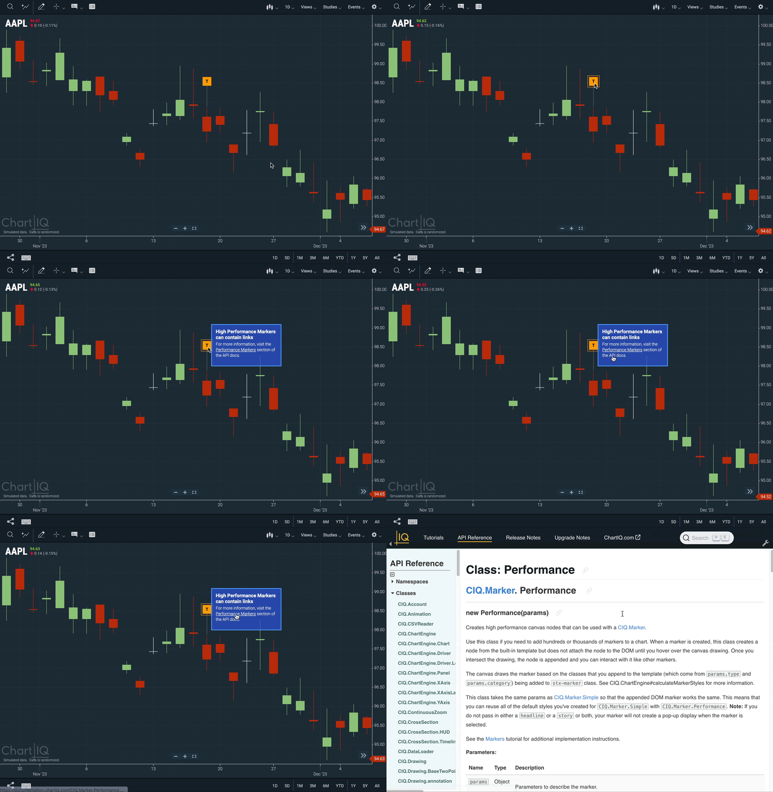 Figure. A high-performance marker with a hyperlink in its story text.
 -
Flutter and React Native SDKs — Developers can now make use of our newly added SDKs for Flutter and React Native, in addition to the existing iOS and Android SDKs. Visit the Flutter and React Native repositories to learn more.
Optional new feature
-
Pinned Markers — Several types of markers can be pinned to the chart.
- Series Tooltips CIQ.Marker.PinnedTooltip
- Simple Markers CIQ.Marker.Simple
- High Performance Markers CIQ.Marker.Performance
Note: This feature requires the file "js/extras/pinnedMarkers.js", which is part of the ChartIQ Extras Package.
- To Enable Pinned Markers, import
./js/extras/pinnedMarkers.jsinto your desired template.
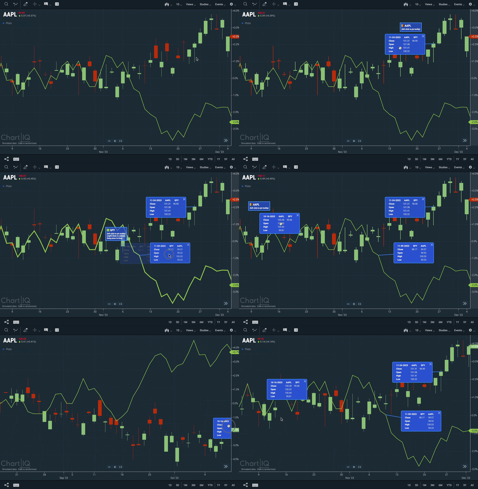 Figure. Tooltips pinned to their series.
Pinnable markers have the following characteristics:
- They can be dragged.
- They draw a stem from themselves to the point of the plot to which they are attached.
- They are closed from a close button (for example, an X in the corner).
- They disappear when series is deleted.
- They can persist in storage and will restore when the page reloads.
A user can pin a tooltip by:
- Hovering over the primary series and left-clicking the resulting tooltip's pin icon
- Left-clicking the primary series
- Left-clicking an event
Left-clicking the pin icon unpins the tooltip, causing it to disappear.
If the range selector is active it will display the location of any pinned marker.
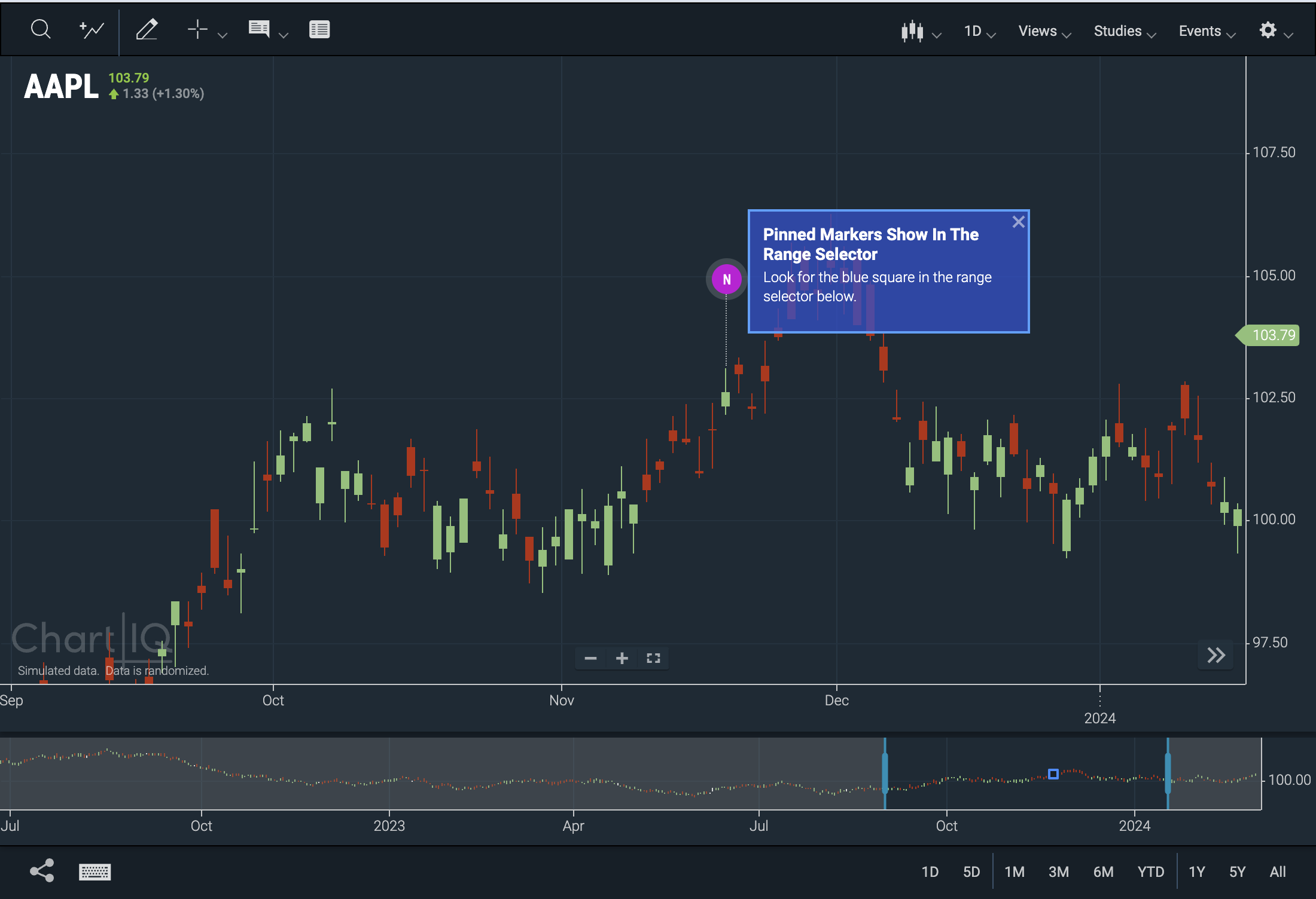 Figure. Range Slider for pinned markers.
-
Updated constructor functions CIQ.Marker.Simple and CIQ.Marker.Performance add
params.pinnable. Set this boolean totrueto make all markers of the desired type pinnable. -
New Class CIQ.Marker.PinnedTooltip is a pinned tooltip HTML marker class. Do not call its constructor function directly. Instead, use the CIQ.Marker.PinnedTooltip.create function to call this.
-
New CIQ.Marker.Simple#click function is a click event handler for simple markers when they are clicked. Adds or removes the marker's pop-up expand
divto the chart, depending on whether it has already been activated. -
New CIQ.Marker.Simple#remove function hides a marker's expanded text.
-
New CIQ.ChartEngine#allowPinning function checks to see whether pinning tooltips is universally allowed, or allowed based on plot type or gesture.
-
New CIQ.ChartEngine#leftClickPinTooltip function. If a series is clicked with the left mouse (or tapped on a touch device), a tooltip will be created showing the price information either for that series or all series on the panel, depending on the value of CIQ.Marker.PinnedTooltip.includeAllSeries.
-
New CIQ.Marker#createSliderMarker function creates a small marker on the range selector.
-
New CIQ.Marker#makePinnable function makes an event marker pinnable. See CIQ.PinnedMarker for details.
-
New CIQ.Marker.PinnedTooltip.create function creates a tooltip in the form of a marker when a tap occurs on a plot which is highlighted.
-
Update to CIQ.Marker.PinnedTooltip adds property
enablewhich controls whether the tooltip can be pinned. -
Update to CIQ.Marker.PinnedTooltip adds property
columnsandrowswhich set the layout of the tooltip. -
Update to CIQ.Marker.PinnedTooltip adds the property
includeAllSerieswhich controls whether the other series appearing on the panel, besides the one clicked on, are included in the tooltip. -
New CIQ.PinnedMarker namespace contains functions required to make a marker "pinnable".
-
New CIQ.PinnedMarker.NameValueStore function defines a storage constructor.
Enhancements
-
Web component re-architecting — We have updated and rationalized the architecture of our web components. Functionality that previously required API methods can now be achieved through dynamic and reactive attribute tags. This change brings our web component architecture up to date with the latest patterns in framework development, making it easier for developers working in frameworks (especially React) to customize our library.
- Our web components can now emit events through changes in their tag attributes. These events can be listened for with, for example, custom React hooks.
- Conversely, you can now send an event or change in state to a component by changing an attribute, allowing the component to react to this change. Previously, you would have to call a function to achieve this effect, which is both more onerous and more prone to error.
- A component does not have to be active to listen for these events. An attribute can be changed even if the component is not visible. This can be particularly useful when changing themes.
- Similar to the way React manages state, events can be saved in local storage and then picked up by an attribute change when a particular component loads again.
Our framework apps have been updated to use the new web-component architecture.
This rearchitecting has enabled us to make our UI much more accessible. (See above).
-
Tooltip update — The active chart type now dictates what information is conveyed within the tooltip (e.g., If the Candles chart type is active, the floating tooltip will display the date/time, open, high, low, and close prices. If the Mountain chart type is active, only the date/time and close price will show, etc.). If a study is enabled, information pertaining to the study is also displayed in the tooltip.
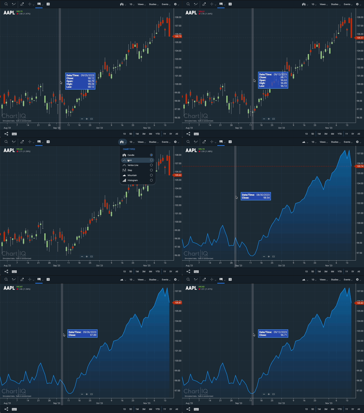 Figure. The active chart type now dictates what information is conveyed within the tooltip.
 -
Markers can be added on non-primary series — Markers can easily be attached to non-primary series, such as a comparison series. These markers remain attached even when the series moves. Both DOM and high-performance markers allow their expand section to be moved and their position stored in local storage.
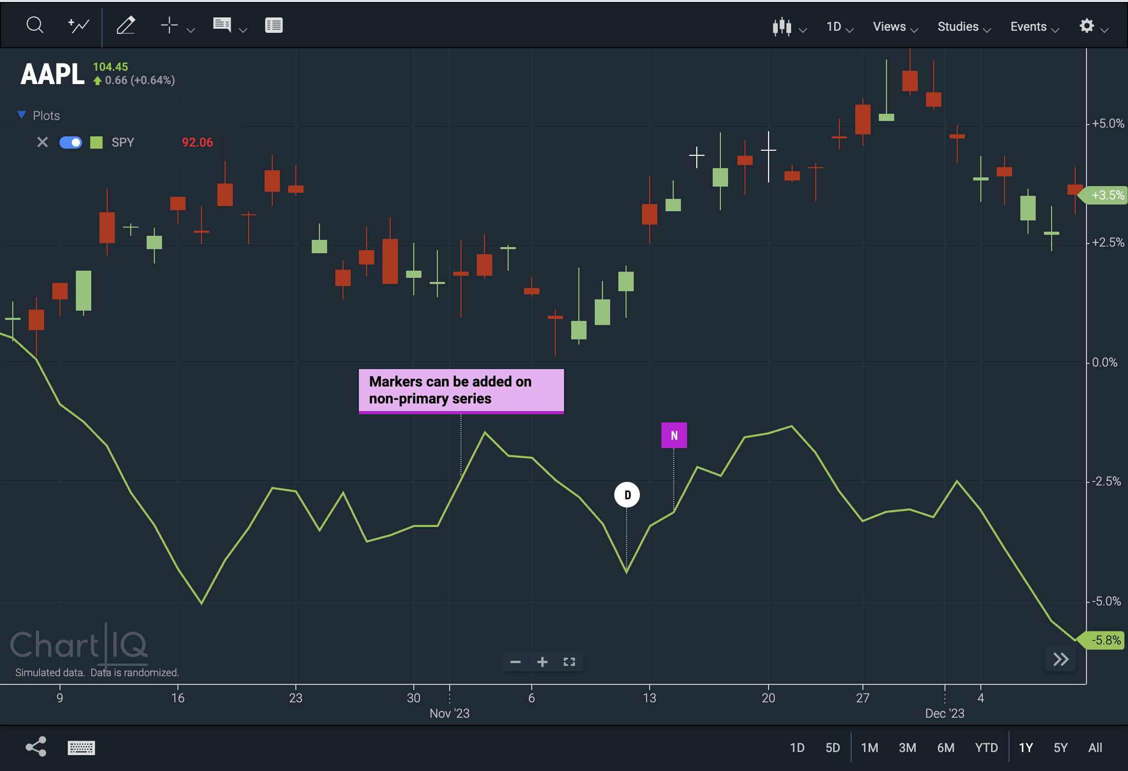 Figure. Markers attached to a comparison series.
- New CIQ.ChartEngine#getPanelByField function retrieves a Panel based on a field which belongs to it.
-
Heads-up display (HUD) default setting — When enabling the Info drop-down, "Show Tooltip" is now the default selection.
 Figure. Show Tooltip is now the default selection
 -
SignalIQ code examples for toast messages and JS events — There are now examples of how to add two new signal types, a Toast Message and a JS Event. You can find the sample code in /dev/signaliq_demos.
-
IANA time zone changes & market holidays
- Updated time zones to the Internet Assigned Numbers Authority's most recent data, 2023c.
- Added market holidays through 2025.
-
New CIQ.isSubsetOf utility function checks to see if an object is a subset of another object. For example, you can use this function to inspect an object with numerous properties, checking if specific properties are contained within it.
UI Enhancements
-
Rounded hover states for toolbar buttons — Rounded corners now appear when hovering over toolbar buttons to provide greater UX consistency with ChartIQ menu items and with applications in which ChartIQ is embedded.
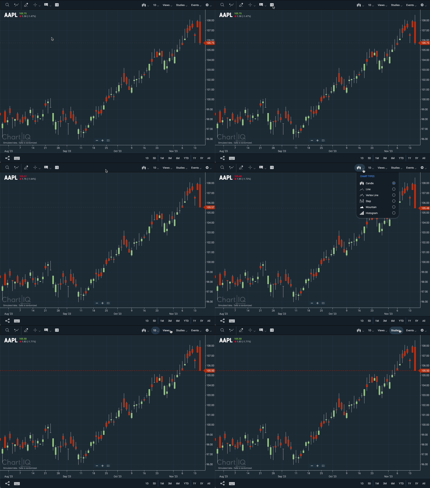 Figure. Toolbar buttons have rounded corners on hover
 -
Movable Heads-Up Display — The heads-up display, which can be enabled and disabled from the drop-down menu of the crosshairs control, can now be repositioned using drag-and-drop user interactions.
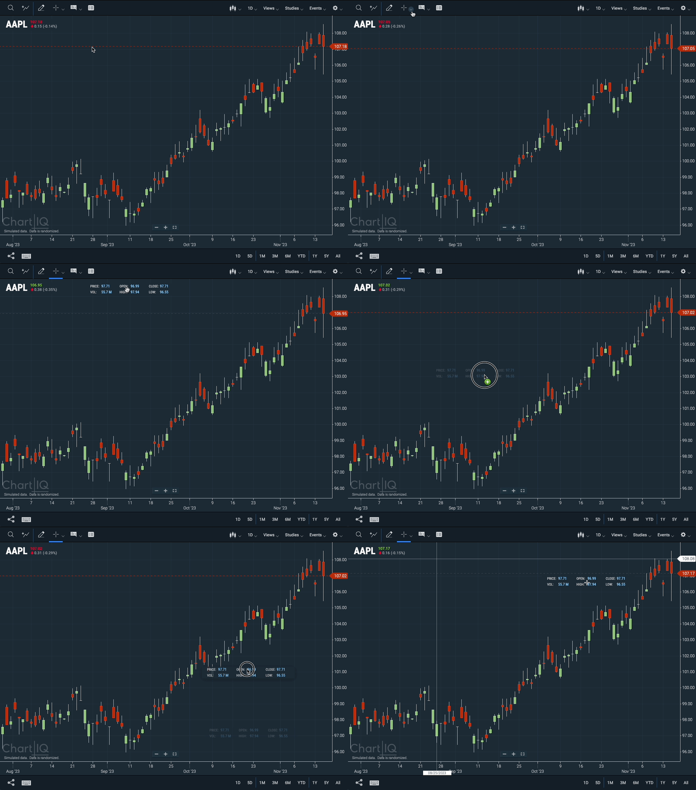 Figure. The heads-up display (HUD) can now be repositioned using drag-and-drop user interactions.
 -
Chart legend updates — The chart legend now includes studies, as well as color swatches for each series.
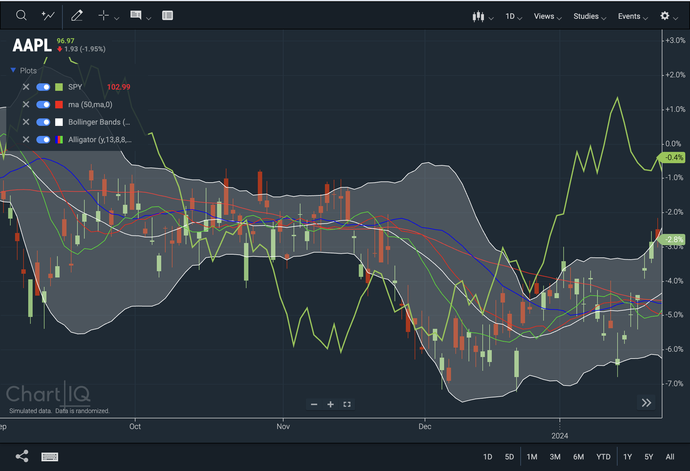 Figure. The chart legend contains studies and color swatches.
-
New CIQ.ChartEngine#getStudies function returns an array of studies that match the given filters.
-
Update to CIQ.drawLegendItem function to add
borderColoras a parameter.
-
