
Series, Comparisons and Renderers
An explanation of the addSeries() method
Initially, a chart contains a single series of data, but additional series can be added with CIQ.ChartEngine#addSeries. The most common use for additional series is to produce comparison charts. A comparison chart displays two or more securities, each one plotted by percentage change from a known starting point. Series are linked to "renderers" to create different visualizations on the chart.
Using addSeries()
addSeries() adds additional data to stxx.chart.masterData.
When a quotefeed is attached to the chart engine, adding a series will prompt a fetchInitialData() call. The results of that fetch are then merged into the masterData array.
Example, adding a comparison series to a chart that has a quoteFeed attached to it, to be displayed as a red line :
stxx.addSeries("GE", { isComparison: true, color: "#FF0000" });
You can also provide data directly:
Example, add a series and provide the data :
stxx.addSeries("GE", {isComparison: true, color: "#FF0000", data: [...the data...]});
Note: When providing data statically, the quoteFeed will not manage pagination or updates for the series, and your array should contain objects with DT/Date and Close/Value fields.
Once a series has been added, the masterData will contain additional fields for that series. If you add multiple series, then multiple fields will be added.
Example, a data object from masterData after adding two additional series: GE and IBM :
{
	"DT": [object Date],
	"Date": "20160101125943",
	"Close": 112.13,
	"GE": {
		"DT": [object Date],
		"Date": "20160101125943",
		"Close": 54.54
	},
	"IBM": {
		"DT": [object Date],
		"Date": "20160101125943",
		"Close": 165.32
	}
}
Note: your masterData might also contain Open, High, Low, Volume or other fields.
The objects in masterData are processed and cloned into dataSet, then dataSegment, and eventually, the chart engine traverses dataSegment to render the chart. The chart engine uses a "renderer" to create the visual for the series. The default renderer in addSeries() simply draws a line, but you can explicitly request the series to use any of the available renderers to produce different visualizations of the series data.
It is not necessary for a series field to exist in every masterData element. Series data can also extend beyond the borders of masterData. The chart engine will intelligently compose masterData from the various independent series that are provided. When a renderer encounters an object without a data point for its series (a "gap") it will usually form a gap on the screen. The most common case is when comparing two symbols that trade on different hours.
Example, an FX security compared with a US stock shows gaps where one of the series has no data:

See CIQ.ChartEngine#addSeries for a complete list of parameters and a variety of examples.
To remove a series call stxx.removeSeries("GE"); .
Adding a series for existing data
Imagine you want to draw a series based on the 'Close' price which is already part of masterData, you just call:
stxx.addSeries("Close", {
	color: "blue",
	loadData: false
});
See it working here:
Example:
Y-Axis
The y-axis must increase its range to accommodate all of the series prices that are displayed. If series prices are very wide apart, this can result in a chart with very tiny lines.
Example, The prices for T and IBM are so far apart that the chart isn't useful :
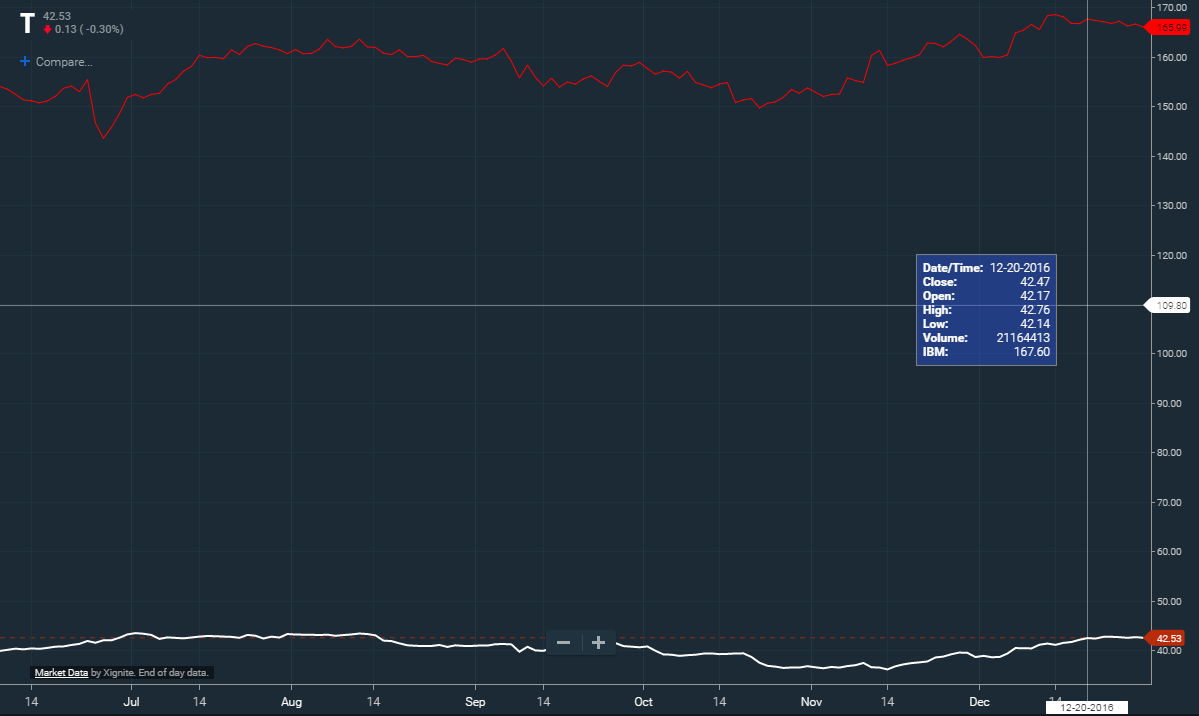
stxx.addSeries("IBM", { color: "#FF0000", shareYAxis: true });
By default, additional series are "overlaid" onto the primary symbol. The y-axis retains the range of the primary symbol, and the actual prices of the overlaid series are reduced to fit in the same segment. In this way, an overlaid series retains the same visual movement that it would have if it were the primary. Note: If you want series to share the same y-axis then pass shareYAxis:true when adding the series.
Example, now IBM is overlaid so that we can visually see the price action :
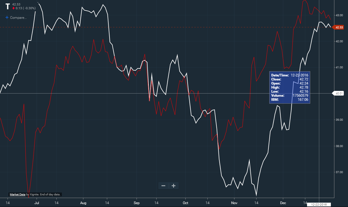
stxx.addSeries("IBM", { color: "#FF0000" });
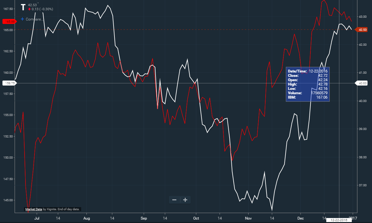
While an overlay shows the price action for two symbols, it doesn't show how they performed relative to each other. Setting isComparison:true when adding a series will set the chart into comparison mode. In this mode, the y-axis is transformed to represent the percentage change of each series. By convention, the comparison begins at the left edge of the chart. As a user zooms or scrolls, the computed ranges will change.
Example, IBM price change showed in percentage comparison :

stxx.addSeries("IBM", { color: "#FF0000", isComparison: true });
Sometimes it's preferable to provide each series with its own y-axis. The visual representation of price movement is the same as in overlay mode but the overlaid series will have its own price range displayed on a separate y-axis. We can use an advanced renderer to accomplish this (more on renderers later).
Example, IBM is given its own y-axis :
Letting addSeries automatically create and link the renderer to the data:
var axis = new CIQ.ChartEngine.YAxis({ position: "left" });
stxx.addSeries("IBM", {
	renderer: "Lines",
	name: "lines",
	type: "lines",
	yAxis: axis,
	color: "red"
});
Having addSeries only load the data, and manually creating and linking the renderer to the data:
var axis = new CIQ.ChartEngine.YAxis({ position: "left" });
var renderer = new CIQ.Renderer.Lines({ params: { name: "lines", type: "line", yAxis: axis } });
renderer = stxx.setSeriesRenderer(renderer);

stxx.addSeries("IBM", {}, function() {
	renderer.attachSeries("IBM", { color: "red" }).ready();
});
Note that when you are explicitly creating and linking a renderer to the series, you do not want to specify the color or renderer on the addSeries call.
Series legend
If you want a legend to appear when a series is added to the chart, you must first define the location in stx.chart.legend. This is done by providing the x and y coordinates for the first element in the legend as follows:
stxx.chart.legend = {
	x: yourXlocation,
	y: yourYlocation
};
Once set, a legend item for each series you add will be added as defined by your CIQ.ChartEngine.Chart#legendRenderer function, which by defaults draws legend items horizontally, but you can customize to render any way you prefer.

Advanced Series settings
The series library will accommodate continuous or sporadic data points. If the data for the series can be measured in the same interval as the primary symbol, the series will render as be a continuous line. In contrast, a "dividend" payment for example, would only occur on a quarterly basis (sporadic). Sporadic data points are automatically connected with continuous lines, however if type="step" is selected in parameters, then the line will be drawn horizontally between sporadic points and then step vertically to the next point, like stairsteps. You can alternatively set sporadic points to connect using dashed lines by defining a color and pattern in parameters.gaps . You can also have the series lined to the default y-axis or create a new axis on the other side of the chart. See CIQ.ChartEngine#addSeries and Renderers section of this tutorial for full details
Here is an example of series using a left axis:
Users can delete a series the same way that they can delete an overlay, by hovering over it and right clicking (or tapping the trashcan icon on a touch device). To prevent users from deleting series set the permanent to true" :
var myseries = stxx.addSeries("SNE", {
	display: "Sony",
	width: 4,
	color: "purple",
	permanent: true
});
Sometimes it is desirable to display a series either on the top half, bottom half or centered on the screen. Positioning can be controlled using the marginTop and marginBottom parameters. Setting these to a whole number will control the margin or padding between the top or bottom of the series and the top or bottom of the chart. If you set these values to a number between 0 and 1 then the parameter will be interpreted as a percentage and automatically adjust to the size of the chart.
Renderers
Renderers provide a way to add visualizations for additional data series. In a standard securities chart, there is generally a line or candlestick that represents the price of the security over time. Frequently, however, we wish to plot additional points of data. The most common situation would be plotting the price for another security, as in a comparison chart. Or you might want to plot any sort of data: banking data, sentiment, etc.
Renderers get their data from "series". A series of data is added to the chart with the CIQ.ChartEngine#addSeries method; which can also automatically create and link a particular renderer to the series data. Alternatively, you can explicitly create your own render and manually link it to a particular set of data.
The following is a list of the most commonly used renderers:
- Lines
- Bars
- HLC
- Candles
- SimpleHistogram
- Scatter (advanced package)
- Histogram (advanced package)
- Heatmap (advanced package)
- Shading (advanced package)
For a complete list see the Renderer page.
New renderers can be derived from the CIQ.Renderer base class by following the pattern used in the existing renderers.
Renderers are permanent in much the same way that overlays are permanent. You only need to add a renderer to the chart once. The renderer will continue to exist between loadChart() calls (between symbol changes, periodicity changes, etc). However, as the developer you are responsible for ensuring the existence of the series data. When using a Quotefeed this will be done automatically but if you are pushing data into the chart be aware that the renderer data will be cleared any time the masterData is reset (when loadChart() is called).
Most frequently a Renderer will not share the same y-axis scale as the underlying security. You can define a separate y-axis for the renderer.
Here is an example of series using a left axis:
Here is an example of multiple series, each one with its own right axis:
Remember that when using a renderer, you do not want to specify the color on the addSeries call, unless you really want to display that series twice; once with the generic renderer, and then again with the custom renderer.
Lines
This renderer will draw a line for each series that is attached. This renderer is used by CIQ.Comparison, which draws comparison charts. This renderer may also be used to create mountain, baseline, and step charts.
Bars
This renderer will draw bars for each series that is attached. The vertical portion denotes the high-low range, while horizontal ticks on either side of the vertical denote the open and close. This renderer may also be used to create colored bars.
HLC
This renderer will draw a variant of standard bars, without the open tick, for each series that is attached. This renderer may also be used to create colored hlc bars.
Candles
This renderer will draw candlesticks for each series that is attached. This renderer may also be used to create hollow or volume candles.
SimpleHistogram
This renderer will draw a histogram for each series that is attached. Only one series can be displayed with this renderer; to display multiple series with a stacked or clustered histogram, use the Histogram renderer described below.
Scatter
This renderer will draw unconnected points for each series that is attached.
Histogram
This renderer will draw a histogram (aka "Bar Chart"). If multiple series are attached, the histogram will display as "overlaid." This can be customized by changing the subtype parameter to "stacked" or "clustered."
Shading
This renderer will draw a line for each series that is attached and will shade the space between them.
Study Overlays vs. Series/Renderers
An overlay is a study that is displayed on the chart. There is overlap between renderer and overlay functionality but generally you should use an overlay if:
- The overlay data is derived from price data
- The overlay data shares the same y-axis scale as the underlying price data
- You wish to leverage the studyLibrary, tools and UI for studies
Since renderers are designed specifically to use series data, they are most useful when you need to graphically represent multiple series.
Sample Code
Create a Stacked Histogram
Note: Stacked histograms should not be used with a combination of negative and positive values, nor should they be used with a baseline.
function createRenderer() {
	var axis2 = new CIQ.ChartEngine.YAxis(); // Define a y-axisfor the renderer
	axis2.position = "left"; // Position that axis on the left side of the chart

	// configure the histogram display
	var params = {
		yAxis: axis2,
		name: "My Data",
		type: "histogram",
		subtype: "stacked",
		heightPercentage: 0.7, // how high to go. 1 = 100%
		widthFactor: 0.8 // to control space between bars. 1 = no space in between
	};

	//legend creation callback
	function histogramLegend(colors) {
		/* your code to draw a legend*/
	}

	var histRenderer = stxx.setSeriesRenderer(
		new CIQ.Renderer.Histogram({ params: params, callback: histogramLegend })
	);

	// add the histogram series, here we use the default QuoteFeed
	stxx.addSeries("EWZ", { display: "Brazil", data: { useDefaultQuoteFeed: true } });
	stxx.addSeries("EWJ", { display: "Japan", data: { useDefaultQuoteFeed: true } });

	histRenderer
		.removeAllSeries()
		.attachSeries("EWZ", "#6B9CF7")
		.attachSeries("EWJ", "#95B7F6")
		.ready(); //use ready() to immediately draw the histogram

	// Additional sample code:

	// remove a single stack from the histogram
	// histRenderer.removeSeries("EWZ").ready();

	// remove all stacks from the histogram
	// histRenderer.removeAllSeries().ready();

	// remove the entire histogram renderer
	// stxx.removeSeriesRenderer(histRenderer);
}
Create a Line Renderer
function createRenderer() {
	var lineRenderer = stxx.setSeriesRenderer(
		new CIQ.Renderer.Lines({ params: { name: "lines", type: "line" } })
	);

	// add the comparison series.

	// Use "gaps" when you have series data that trades on different sessions. For instance a 24x7 forex symbol vs. a US equity

	// Use "permanent" to prevent the user from removing the series by right clicking

	stxx.addSeries("AAPL", {
		display: newSymbol,
		isComparison: true,
		data: { useDefaultQuoteFeed: true },
		gapDisplayStyle: { pattern: [3, 3] },
		width: 4,
		permanent: true
	});

	stxx.addSeries("NOK", {
		display: "Nokia",
		isComparison: true,
		data: { useDefaultQuoteFeed: true },
		gapDisplayStyle: { pattern: [3, 3] },
		width: 4
	});

	lineRenderer
		.removeAllSeries()
		.attachSeries("AAPL", "#FFEE00")
		.attachSeries("NOK", "#FFBE00")
		.ready();
}
For additional reference see:
CIQ.ChartEngine#addSeries
CIQ.ChartEngine#removeSeries
CIQ.ChartEngine#setSeriesRenderer
CIQ.ChartEngine#removeSeriesRenderer
CIQ.Renderer ( a list of all available renderers can be found here )
CIQ.Renderer#attachSeries
CIQ.Renderer#removeSeries
CIQ.Renderer#removeAllSeries
CIQ.Renderer#ready
CIQ.Renderer#adjustYAxis
CIQ.Renderer#draw
CIQ.Renderer#drawIndividualSeries