
Multi Periodicity Support
Note: The sample-template-advanced.html and technical-analysis-chart.html templates are identical. Instructions for one template apply equally to the other.
Introduction
Version 9.6.0 introduced the Multi Periodicity Support plugin, enabling the combination of low-frequency data (e.g., quarterly) with high-frequency data (e.g., daily) on a single chart.
This enhances data visualization by providing a comprehensive view of trends across different time frames.
In this tutorial
We will go over the basics of getting a chart set up using the Multi Periodicity Support plugin.
Before you begin
This tutorial requires version 9.6.0 or later of the ChartIQ library, along with the Multi-Periodicity Support plug-in.
To obtain a copy of the library and the plug-in, please reach out to your Account Manager.
Getting Started
Important Considerations
The plugin will render spans of data for each period, with the start of the span given as "Date" and the end as "EndDate".
For example:
{ Date: "2023-01-01", EndDate: "2023-03-31", Close: 250390 }
With certain data, you may encounter issues where data points overlap, usually caused by the start of a period being offset by more or less than the period length. Since the plugin is not designed to render overlapping spans, it could produce unexpected results prior to v10.1.0, requiring you to adjust data spans before sending them to the library for processing. In v10.1.0, the start period is internally adjusted to be no earlier than the previous span's end, preventing overlap. If a different solution for overlap resolution is needed, either "Date" or "EndDate" must be adjusted.
Given that the available data often has only one date, typically at the end of a period, the plugin can calculate both the start and end of the period.
For example, if only the end data point is available, it can be provided in the "Date" property of quotes, and endOfPeriod should be set to true for data loading:
{ Date: "2025-03-31", Close: 250390 }
This allows the plugin to internally calculate the span equivalent to a provided quote of:
{ Date: "2025-01-01", EndDate: "2025-03-31", Close: 250390 }
It has been observed that sometimes available data provides a date at the beginning of the following month, which could be the reported date for the period that ended in the previous month.
For example:
{ Date: "2025-04-02", Close: 250390 }
Prior to v10.1.0, this would result in incorrect calculation, as it was expected for endOfPeriod to be set to true with the date indicating the end of the month. Starting with v10.1.0, the plugin is adjusted so that when endOfPeriod is set to true and the date is at the beginning of a month, the previous month is used for calculating span start and end dates.
Importing
The following examples will utilize the sample-template-advanced.html or technical-analysis-chart.html files.
In your template, uncomment or import the following line:
import "./plugins/lowfrequency/index.js";
Adding A Series
The ChartEngine.addSeries and Renderer.attachSeries methods now accept two additional parameters: labels and periodicParams.
In the example below, we’ll use the addSeries method, which can accept a variety of parameters. For this instance, we will specifically use the following:
idcolorperiodicParamslabelsrendereryAxisdata
Example: Copy & paste the below into your developer console.
Important: For the Multi-Periodicity Support plugin, you are not limited to using static data, as demonstrated in the example below. This plugin will also work with data from the quotefeed, provided it is formatted correctly. For more information on setting up your quotefeed, please refer to the Data Integration: Quotefeeds tutorial.
stxx.addSeries(
  "C_quarterlyNetIncome",
  {
    color: "green",
    renderer: "Histogram",
    periodicParams: { period: "quarter", endOfPeriod: true },
    labels: {},
    yAxis: {
      position: "left",
      baseline: 0
    },
    data: [
      { Date: "March 31, 2023", Close: 0.13e9 },
      { Date: "June 30, 2023", Close: -1.63e9 },
      { Date: "September 30, 2023", Close: 1.85e9 },
      { Date: "December 31, 2023", Close: 1.80e9 },
      { Date: "March 31, 2024", Close: 0.87e9 },
      { Date: "June 30, 2024", Close: 2.18e9 },
      { Date: "September 30, 2024", Close: 2.12e9 },
      { Date: "December 31, 2024", Close: 3.66e9 },
      { Date: "March 31, 2025", Close: 3.05e9 },
      { Date: "June 30, 2025", Close: 5.30e9 },
      { Date: "September 30, 2025", Close: 4.80e9  }
    ]
  }
);
After pasting the above code, your chart should display the green 'quarterly' periodicity histogram bars alongside 'monthly' periodicity candles.
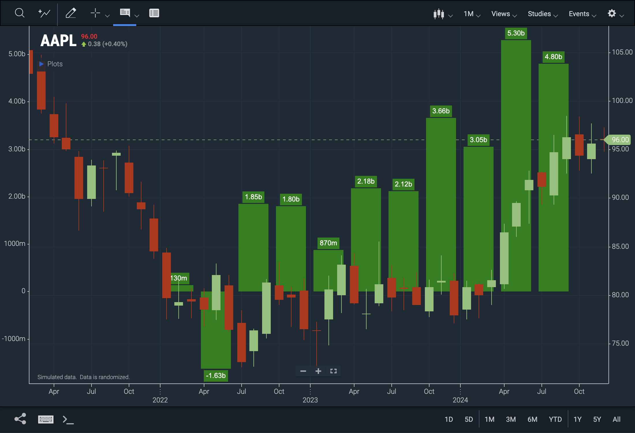 Figure. Quarterly data presented alongside monthly data for comparative analysis.
Example Review
Adding multi-periodicity data is fairly straightforward—simply provide data with a larger periodicity to the addSeries method and specify its periodicParams. However, keep the following points in mind:
- Use a histogram renderer for larger periodicities, as it presents the data more effectively.
- Ensure you include the
periodicParamsproperty. - If there is a significant difference between higher-frequency and lower-frequency data values, assign a separate y-axis to the data, especially if it may contain negative values.
Understanding periodicParams
The periodicParams object indicates that the supplied data is periodic and needs to be expanded for a specified range. It includes two properties: period and endOfPeriod.
-
period: Indicates how the chart should interpret the data. For quarterly data, set it to "quarter." Other options include:- "month"
- "quarter"
- "fiscal_half"
- "year"
-
endOfPeriod: Indicates whether the periodic data's Date property is at the end of the period instead of the default beginning. Include this property when using end-of-period data.
SeriesManager
The SeriesManager is a convenience class designed to manage the addition, modification, and removal of series and instruments from the chart. It encapsulates the addSeries, modifySeries, and removeSeries methods within its own methods: add, remove, and modify.
Using the SeriesManager methods for adding periodic or low-frequency data is recommended, as they perform significant tasks behind the scenes:
-
Automatically switches to the "Histogram" renderer for larger periodicities and sets the "subtype" to "clustered" for multiple series with the same periodicity.
-
Prioritizes layering by placing series with smaller periodicities in front of larger ones.
-
Automatically adds a Y-axis for new series and updates the X-axis for accurate labeling and scaling.
Import SeriesManager
Update your import statement as follows:
import { SeriesManager } from "./plugins/lowfrequency/index.js";
Adding Series using SeriesManager
Example: This example assumes your quotefeed data is formatted for monthly, quarterly, and fiscal half-year periods. You can replace the series IDs with any relevant names for the series you are adding. Alternatively, you can use static data as demonstrated in the previous example.
		let sm = new SeriesManager(stxx) // Create a new instance of Series Manager
		sm.clear(); // Clear the chart
		sm.add("SMCI_monthly", { periodicParams: { period: "month" }, color: "orange", });
		sm.add("NVDA_quarterly", { periodicParams: { period: "quarter" }, color: "green" });
		sm.add("SMCI_fiscal_half", { periodicParams: { period: "fiscal_half" }, color: "aqua" });
Your chart should look something like this:
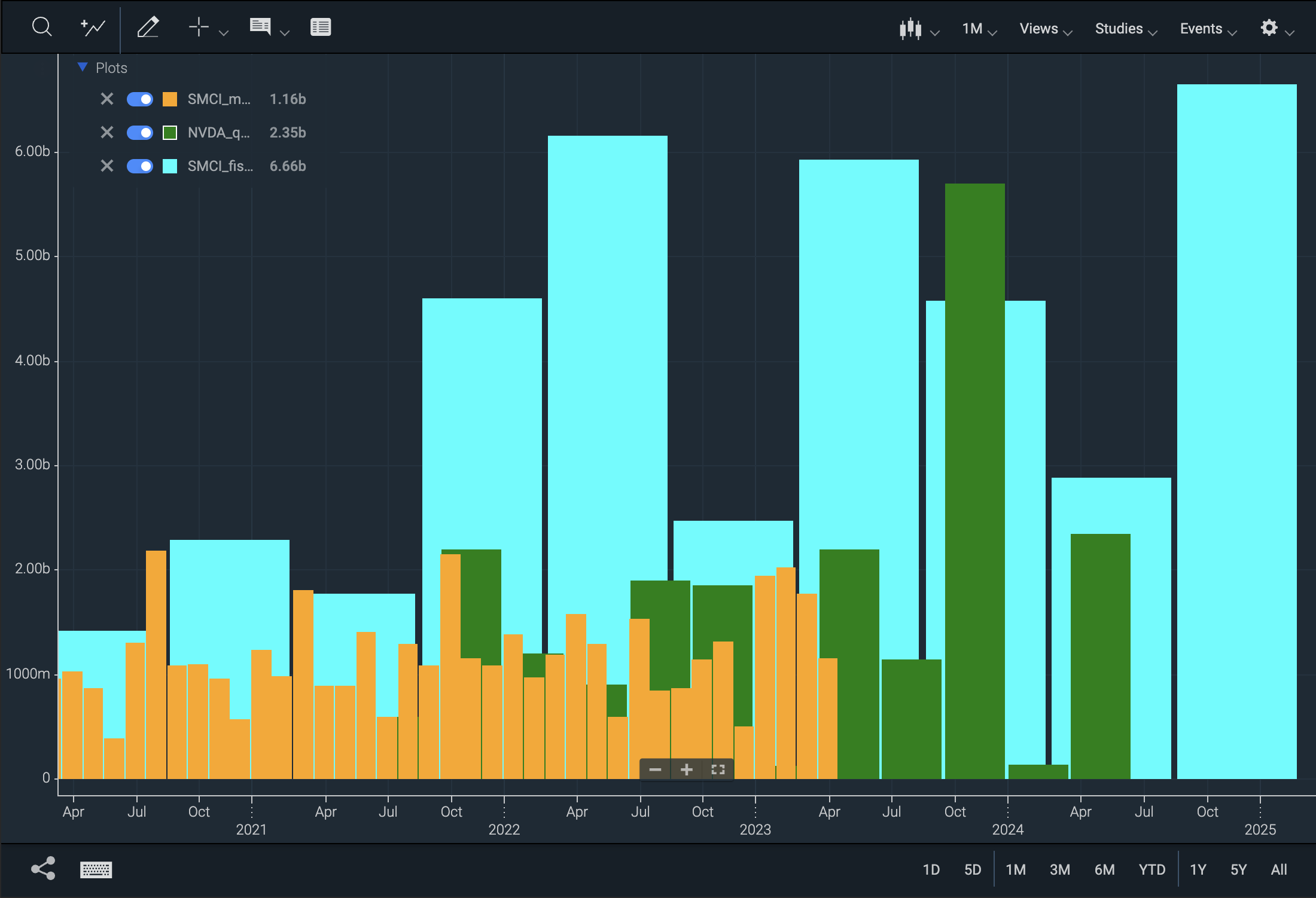 Figure. Monthly, quarterly, fiscal half-yearly low-frequency data.
Extras
Draw Labels
The addSeries and attachSeries methods, encapsulated by SeriesManager, accept a new parameter called labels. This object can be customized with the following parameters; additionally, it can be left empty as labels: {}, which will simply enable the labels on the series:
backgroundColortextColorfontbolditalicpaddingverticalOffsetinsideBarlastVisibleOnly
Example:
const sm = new SeriesManager(stxx);
sm.clear();
sm.add("NVDA_quarterly", {
  color: "green",
  periodicParams: { period: "quarter" },
  labels: {
    backgroundColor: "grey",
    textColor: "white",
    bold: true
  }
});
The resulting chart (assuming your data is formatted correctly) should look something like this:
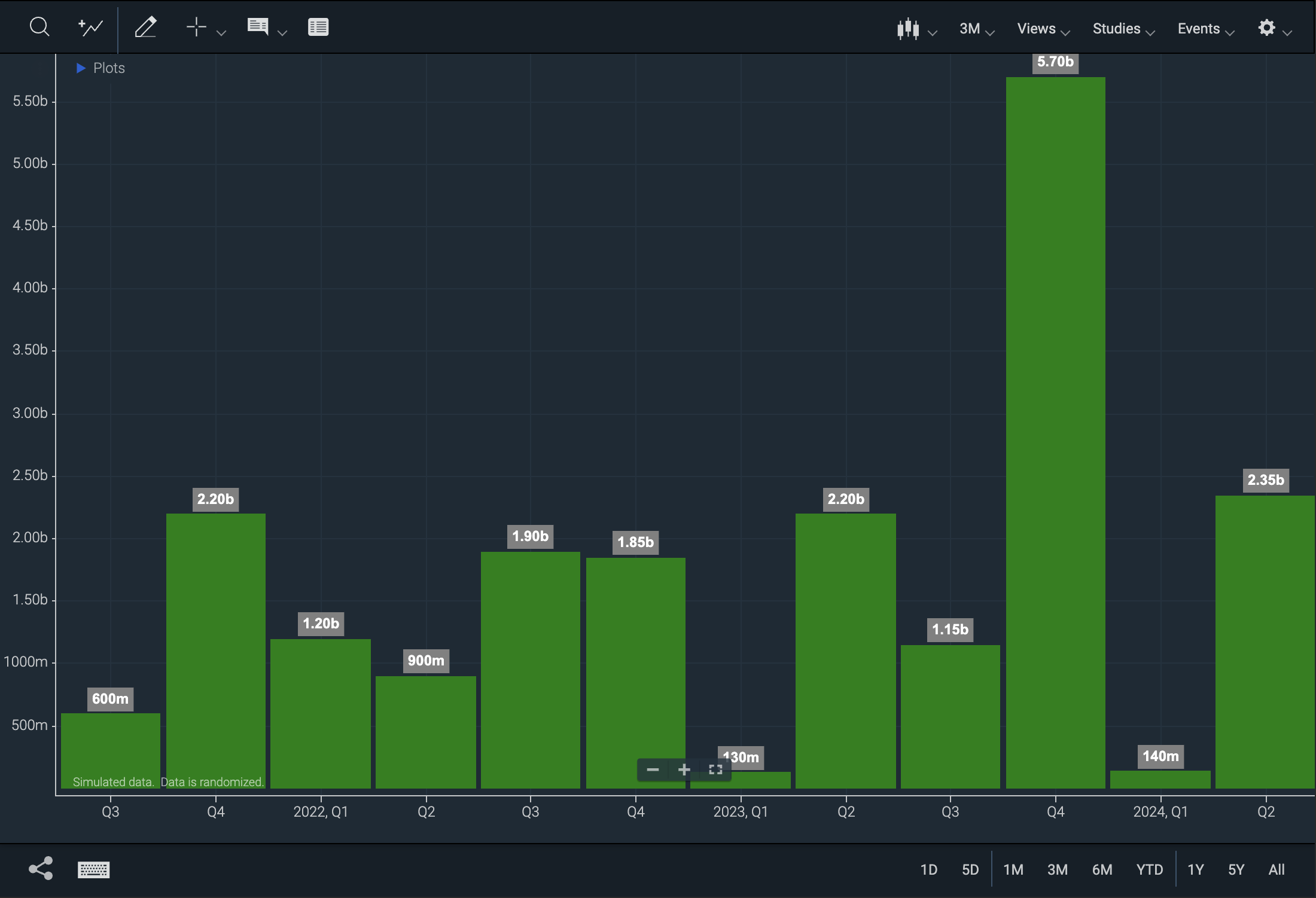 Figure. Multi-periodicity chart with labels enabled.