Version 9.2.0
Release date: Feb 1, 2024
Note: The sample-template-advanced.html and technical-analysis-chart.html templates are identical. Instructions for one template apply equally to the other.
New features
-
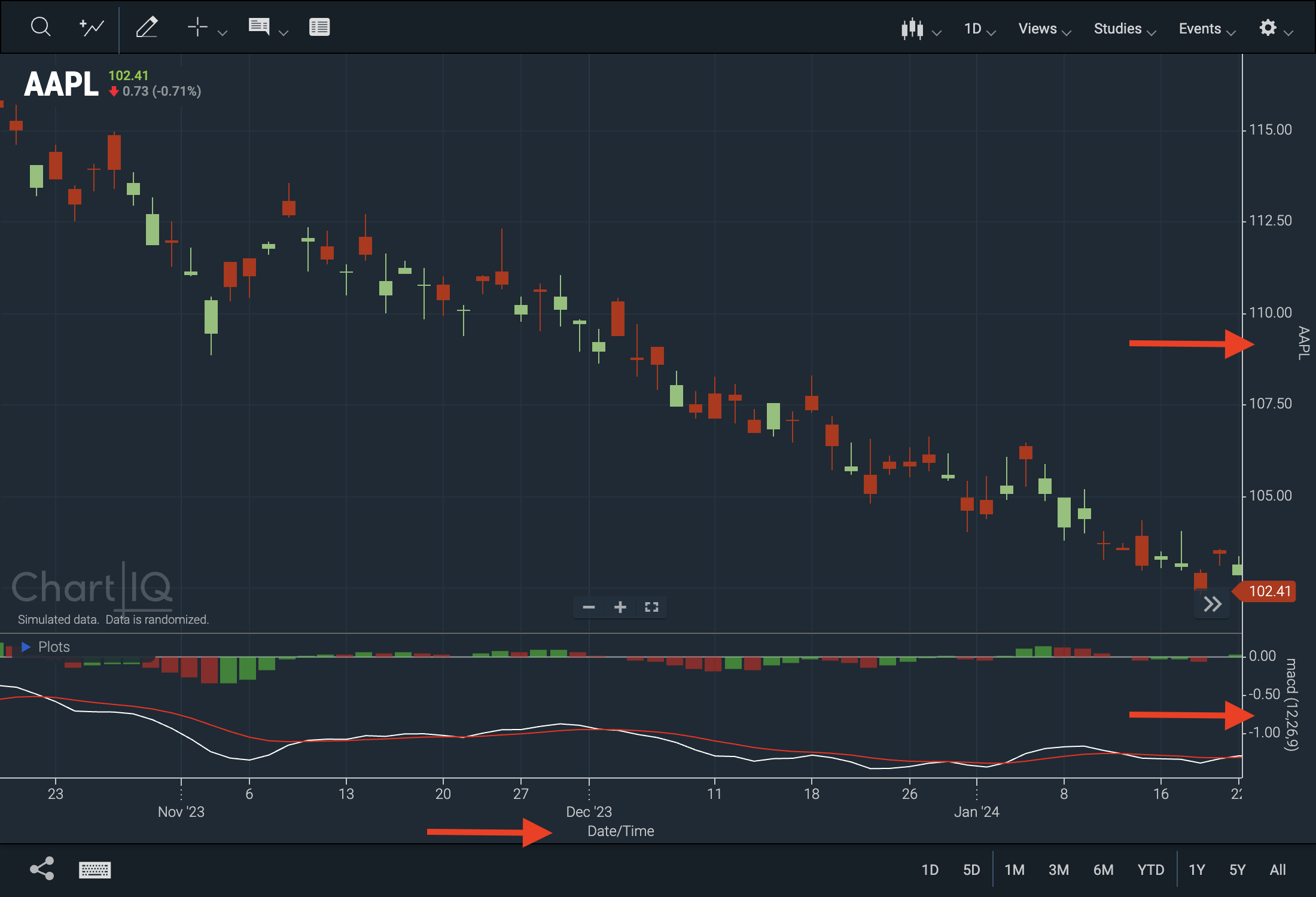
Axis Titles — Charts can now be configured to have titles displayed on their x and y-axes.
- When multiple charts or studies are active, the default y-axis value will default to the name of the corresponding chart or study, unless a different value is explicitly specified.
- The default value for the x-axis is
Date/Time.
 Figure. X and y-axis titles and their default values.
Note: This feature is disabled by default and must be enabled manually in your template. See example below:
// this will enable the x-axis title with its default value stxx.setXAxisTitle({ enabled: true }); // this will enable the x-axis title and set a custom title stxx.setXAxisTitle({ enabled: true, title: "My custom title" }); // this will enable y-axis titles for all y-axes in the current chart stxx.setYAxisTitle({ enabled: true }); // this will enable a y-axis title with a custom title for the y-axis that is passed stxx.setYAxisTitle({ enabled: true, yAxis: selectYAxis, title: "My custom title" })- Update to the CIQ.ChartEngine.XAxis function adds the parameter
title. - Update to the CIQ.ChartEngine.YAxis function adds the parameter
title. - New CIQ.ChartEngine#setXAxisTitle function enables x-axis titles.
- New CIQ.ChartEngine#setYAxisTitle function enables y-axis titles. The y-axis title, once enabled, can be specified in the parameters, or it can default to CIQ.ChartEngine.YAxis#title.
Optional new feature
-
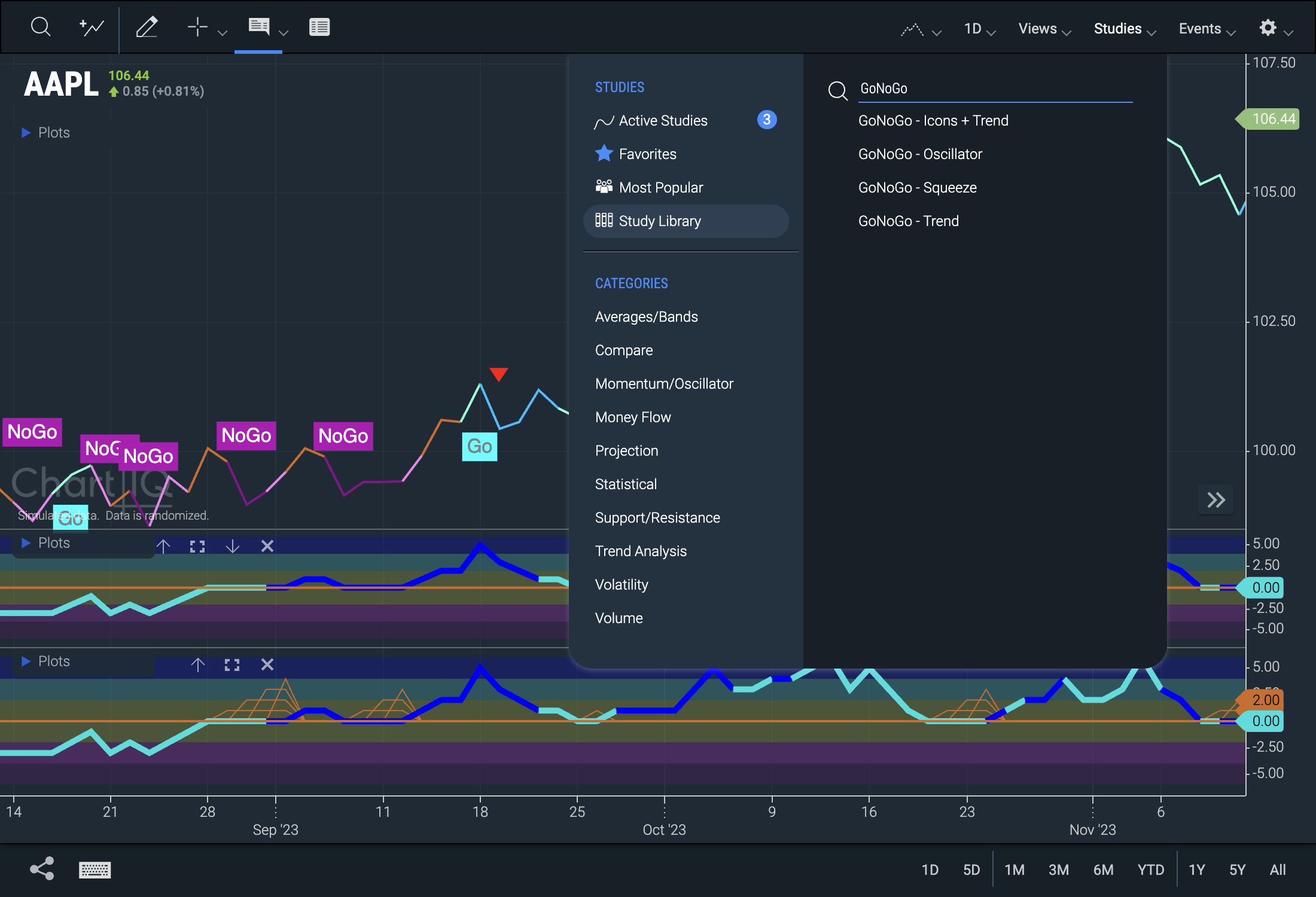
GoNoGo Premium Plugin — The GoNoGo premium plug-in is now available with v9.2.0. This allows for three new GoNoGo studies in addition to GoNoGo - Trend.
Contact your account manager if you wish to purchase this module.Newly Added Studies:
- GoNoGo - Icons + Trend
- GoNoGo Icons + Trend® enhances the GoNoGo Trends® analysis by incorporating intuitive icons to highlight and clarify emerging trends.
- GoNoGo - Oscillator
- GoNoGo Oscillator® helps investors understand the velocity of price change, providing meaningful momentum analysis to give valuable information about the strength of a trend and the market’s conviction in it.
- GoNoGo - Squeeze
- GoNoGo Squeeze® visualizes prolonged reductions in volatility. Like a coiled spring, researchers have shown that following these stalemates between buyers and sellers, a breakout can be expected.
For for details on each GoNoGo study, click the information icon next to the study in the Study Library.
 Figure. Available GoNoGo studies: Icons + Trend (main panel), Oscillator (middle panel), Squeeze (bottom panel).
Uncomment out the following line in sample-template-advanced.html to enable the GoNoGo Premium plug-in:
//import "./plugins/gonogo/goNoGo.js"; - GoNoGo - Icons + Trend
Enhancements
-
Accessibility Enhancements — Ongoing accessibility enhancements include improved screen reader support, keyboard tab navigation, button states, translation and lang attributes, access to symbol search results, and zoom control, among many others.
-
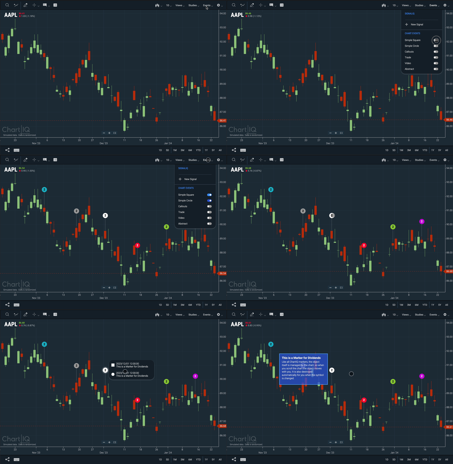
Consolidated Markers — Multiple CIQ.Markers for the same data point are now grouped into one single marker.
- Data points containing multiple events are represented by a colored circle with a number inside it.
- The number corresponds to the count of events contained in that marker.
- The circle's color is determined by the most frequently occurring color.
- Clicking on the circle will open a menu that displays all events for that data point. From there, clicking on any of the events will open the tooltip associated with that event.
 Figure. Certain makers now get grouped into a single marker when more than one is present.
- New CIQ.Marker.GroupNode function creates an HTML marker node used by CIQ.Marker.Group
- New CIQ.Marker.GroupNode#handleClick function toggles "highlight" state of marker
- New CIQ.Marker.GroupNode#updateVisual function updates the marker label and color.
- New CIQ.Marker.GroupNode#updateMarkerList function updates the listing of grouped markers in the expansion. Called when a group marker is clicked.
- New CIQ.Marker.GroupNode#setExpansionHolderVisibility function sets the visibility style of the group expansion holder based on whether it is empty or not
Note: This enhancement currently only defaults to "Simple Circle", "Simple Square", and high performance markers.
For more information, visit the Markers tutorial.
- Data points containing multiple events are represented by a colored circle with a number inside it.
UI Enhancements
-
Candle Borders and Wicks — The candle borders and wicks now match the color of the candle body. This UI enhancement ensures better visibility of candles when the chart is zoomed out completely.
-
Hollow Candles — In previous releases, the hollow candle body matched the background color of the active chart. In version 9.2.0, hollow candles are completely transparent, improving data interpretation when extended hours are enabled.
