
Version 10.2.0
Release date: March 28, 2026
Comparison Edit dialog
Introduced a new settings dialog for adjusting properties of added comparisons.
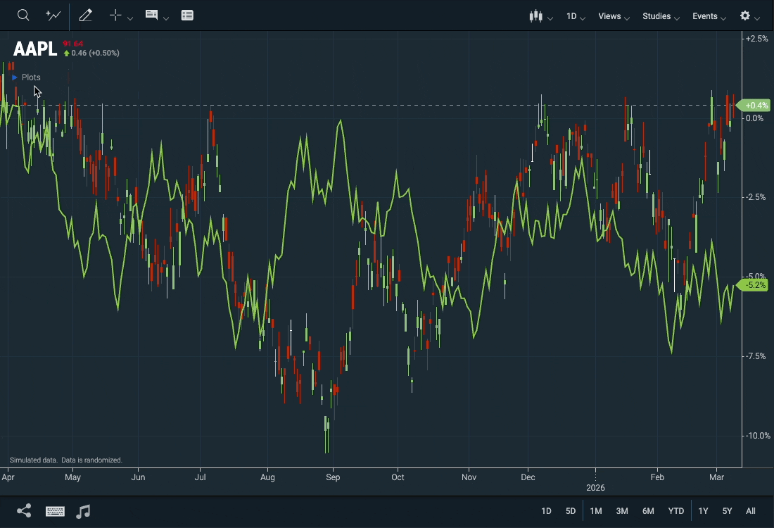 Figure. Series edit dialog
- New WebComponents.SeriesEditDialog Web Component.
- New WebComponents.Comparison#getComparisonLegendColors function.
- New WebComponents.Comparison#renderLegendSwatch function.
Reference data
Edit Dialog
Similar to the comparison edit dialog, users can edit the properties of added reference data. This includes Display Type, Color, Line Style, Panel, Y-Axis, and Axis Label Color.
Certain Reference Data sets also allow changes to the Interval from the settings dialog.
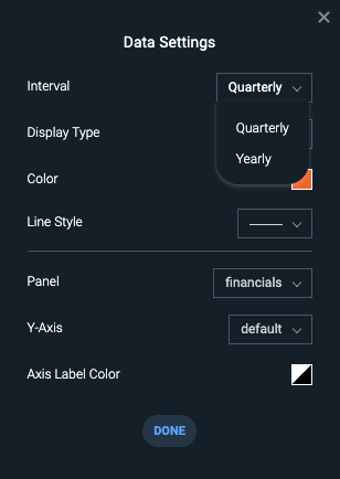 Figure. Reference Data Settings Dialog
Markers and Time Span Legend Items
Reference Data datasets displayed on the chart now appear in the chart's legend. You can customize, toggle visibility, or remove the reference data from here.
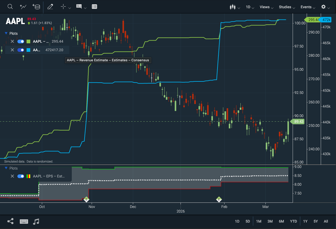 Figure. Reference Data Legend
The Time Span Event plugin includes a legend for toggling Time Span Events individually, which was previously only possible through the Events dropdown menu.
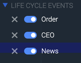 Figure. Time Span Events Legend
- New CIQ.ChartEngine#mergeSeriesEvents function
- New CIQ.ChartEngine#modifyEvents function
Custom Chart Themes Can Be Edited
Edit your custom theme by clicking the cog icon next to it. Radio buttons now indicate the active theme.
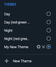 Figure. The cog icon next to custom themes indicates they are editable.
- New parameter options for the WebComponents.ThemeDialog#open method.
Optimized Layout Storage
We've improved performance by storing layout changes only when modifications are detected.
Previously, stxx.changeOccurred("layout") triggered storage updates on every draw loop, which affected performance. Now, layout changes are compared before saving, ensuring updates only occur when necessary.
RSI Zone Lines Can Be Styled
The overbought and oversold lines in the RSI study can now be customized with line style changes, in addition to color adjustments.
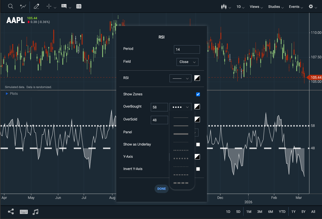 Figure. Customizable line styles for the RSI study
- New WebComponents.StudyParameter#setColor method sets the color swatch to the selected color for study parameters.
23-Hour Trading for NYSE and NASDAQ
ChartIQ now supports extended trading hours for NYSE and NASDAQ.
Further instructions will be provided in a future release when these hours go live.
Crossplot - Evenly spaces x-axis labels
Our crossplot charts now render the X-axis labels and grid lines evenly, rather than following the increments of the provided data.
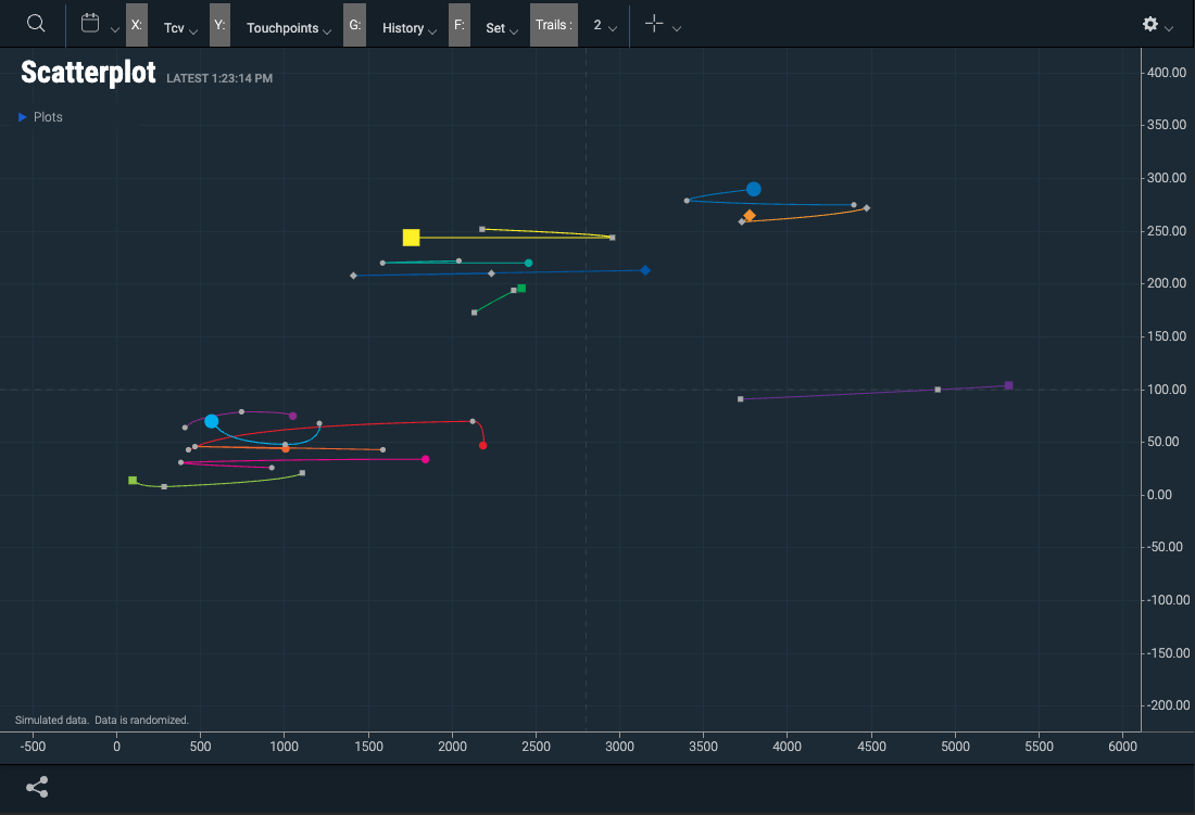 Figure. Evenly Spaced Crossplot X-Axis Labels
- New CIQ.ChartEngine.XAxis#decimalPlaces property controls the number of decimal places on the x-axis labels.
Measure Label On Multi charts
Fixed an issue where, when displaying multiple instant charts, or using the multichart template, the measure tool label would not clearly indicate which chart was using the measure tool. You can also position the tool by overriding the method positionMeasureInMultiChart.
Updated Built-in Studies Guide
Check out the updated Built-in Studies Reference Guide tutorial for a list of available studies, their definitions, and their formulas.
Note: While this list is comprehensive, some Math and Formula sections are missing and will be included in upcoming updates.
Custom Fibonacci Levels Can Be Deleted From Drawings
An X now appears next to user-defined Fibonacci levels in the Fibonacci Settings dialog box, allowing users to delete their added levels, in addition to toggling them on and off with the check box.
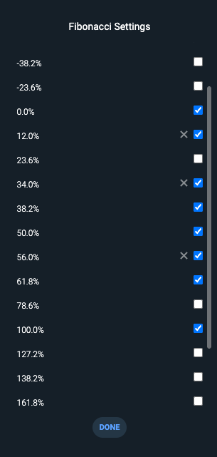
Figure. Users can delete custom Fibonacci levels in the Fibonacci Settings dialog.